Our trading partner J.W. Jones is coming at us today with a great post on where he sees the Treasury ETF TLT headed. Great guidance for where the market at large just might be headed.....
The incredible rally in equities in 2013 has begun to stir concern among many that the stock market is now in a bubble. We have entered the euphoric stage of this bull market and equity prices cannot and will not go lower according to some talking heads in the financial punditry.
While chatter is starting to heat up that equities are in a bubble, the real bubble seems to be ignored for the most part. The larger, more concerning bubble is in the Treasury marketplace where the Federal Reserve continues to print money to purchase treasury bonds to help keep interest rates artificially low.
Instead of debating the bubbles in Treasury’s versus equities, or trying to predict when the bubble in either asset class may pop, I want to focus on the near term for price action expectations in longer dated Treasury bonds.
Here is a weekly chart of the Treasury ETF TLT which is supposed to reflect the price action and yield generation of a portfolio of 20+ year duration Treasury bonds issued by the U.S. federal government.....Read "Option Probabilities Spell Possible Trouble for Treasury’s"
"Wall Streets Best Kept Secret....Now you are in the loop"
Showing posts with label J.W. Jones. Show all posts
Friday, November 15, 2013
Friday, August 16, 2013
Will 1,650 Offer Buying Support for the SP500?
Earlier this week we shared with our readers a great article from our trading partner J.W. Jones where he covered in detail the loomimg correction in the equity markets. Now what? Here's a follow up article that includes the trades J.W. closed this week.......
In my most recent article, I discussed how I was expecting U.S. financial markets to reverse to the downside in the near future. I illustrated the various divergences in a variety of underlying technical indicators which have issued warnings in the past.
Unlike many financial journalists or newsletter operators, I am an option trader first and a writer second. My primary focus is typically to sell option spreads that focus on the passage of time for profitability and/or take advantage of large implied volatility spikes which help to improve my probability of success on each trade taken. Unfortunately in 2013 Mr. Market has not accommodated my style of trading as we have had very low volatility most of the year.
Low volatility levels many times force option traders to take more directional trades which ultimately leads to lower probabilities of success. I still take advantage of stocks that have had implied volatility spikes, but ultimately this market has forced theta sellers to get more aggressive, take more risk, and accept less potential profitability.
I have recently closed several winning positions with members of Options Trading Signals service during the August expiration. Several positions were actually closed Thursday August 15th for gains.
However, what might surprise readers is that several positions that I closed for gains this week and even today were long biased positions. In fact, one of my largest winning trades for the August monthly option expiration cycle was the EWZ Call Debit Spread that was essentially long Brazilian equities.
Here are the detailed results of J.W.'s recent trades
New video....John Carters weekly options method to beat the market makers at their own game!
In my most recent article, I discussed how I was expecting U.S. financial markets to reverse to the downside in the near future. I illustrated the various divergences in a variety of underlying technical indicators which have issued warnings in the past.
Unlike many financial journalists or newsletter operators, I am an option trader first and a writer second. My primary focus is typically to sell option spreads that focus on the passage of time for profitability and/or take advantage of large implied volatility spikes which help to improve my probability of success on each trade taken. Unfortunately in 2013 Mr. Market has not accommodated my style of trading as we have had very low volatility most of the year.
Low volatility levels many times force option traders to take more directional trades which ultimately leads to lower probabilities of success. I still take advantage of stocks that have had implied volatility spikes, but ultimately this market has forced theta sellers to get more aggressive, take more risk, and accept less potential profitability.
I have recently closed several winning positions with members of Options Trading Signals service during the August expiration. Several positions were actually closed Thursday August 15th for gains.
However, what might surprise readers is that several positions that I closed for gains this week and even today were long biased positions. In fact, one of my largest winning trades for the August monthly option expiration cycle was the EWZ Call Debit Spread that was essentially long Brazilian equities.
Here are the detailed results of J.W.'s recent trades
New video....John Carters weekly options method to beat the market makers at their own game!
Labels:
equities,
EWZ,
J.W. Jones,
John Carter,
market,
options,
positions,
spread,
trades,
Volatility
Friday, June 28, 2013
OTS Profits Through the Market Correction
During the recent carnage our friends at Options Trading Signals managed to lock in 16.80%, 32.20%, & 41.49% returns. Let's see how J.W. Jones and the staff at OTS can help us do the same......
As we move into Quarter end, many investors and traders suffered a sizable drawdown in mid to late June. However, members of Options Trading Signals closed 3 trades during the selling carnage for huge overall gains.
As a professional trader, a focus on implied volatility, probability of success, and a typically contrarian market view have served members well since the inception of the service back in December of 2010. A summarized description of recent action in the OTS Portfolio is described below.
On June 13th the OTS Portfolio took a Put Debit Spread on VXX. The reasoning behind the trade was the expectation that volatility would decline going into triple witching on Friday’s expiration. As expected, volatility contracted and on June 19th the VXX position was closed for a gross gain per spread of $21. The maximum risk per spread was $125 so the trade produced a gross gain of around 16.80%.
Entire article > "During Recent Market Carnage, OTS Locked in 16.80%, 32.20%, & 41.49% Returns"
Enroll now for our “Spread Trading Strategies for Growing a Small Account” class this Saturday, June 29th from 1:00 – 5:00 p.m.
As we move into Quarter end, many investors and traders suffered a sizable drawdown in mid to late June. However, members of Options Trading Signals closed 3 trades during the selling carnage for huge overall gains.
As a professional trader, a focus on implied volatility, probability of success, and a typically contrarian market view have served members well since the inception of the service back in December of 2010. A summarized description of recent action in the OTS Portfolio is described below.
On June 13th the OTS Portfolio took a Put Debit Spread on VXX. The reasoning behind the trade was the expectation that volatility would decline going into triple witching on Friday’s expiration. As expected, volatility contracted and on June 19th the VXX position was closed for a gross gain per spread of $21. The maximum risk per spread was $125 so the trade produced a gross gain of around 16.80%.
Entire article > "During Recent Market Carnage, OTS Locked in 16.80%, 32.20%, & 41.49% Returns"
Enroll now for our “Spread Trading Strategies for Growing a Small Account” class this Saturday, June 29th from 1:00 – 5:00 p.m.
Labels:
contrarian,
expiration,
J.W. Jones,
options,
portfolio,
strategies,
Volatility,
VXX
Friday, May 24, 2013
The Headline Data that Financial Media Ignored on Wednesday
Wednesday was a wild trading session where we saw the largest intraday selloff in the S&P 500 E-Mini futures that we have seen in some time. Intraday price action was driven largely by statements made by Chairman Bernanke and the release of the Federal Reserve Meeting Minutes which saw some monster intraday moves and a large spike in the Volatility Index (VIX).
While the world is focused on when the Federal Reserve is going to taper their Quantitative Easing program and the impact those actions will have on financial markets, I wanted to look at another divergence in the economic data which is supported by market action.
Instead of trying to determine how or when the Federal Reserve will taper or end their monetary experiment, I wanted to juxtapose statements that were made today with the actual facts. Readers can draw their own conclusions.
Recently, we have been told that the housing market is in the early stages of recovery. Unfortunately due to low interest rates housing has turned back into a speculative market. Consequently, a lot of so called fast money is flowing into housing which in many cases is either being purchased for rentals or by foreign investors as a speculative investment.
At present the housing market is not being driven by capital formation at the household level and data indicates that construction jobs are under pressure and affordability is reversing.
This first chart illustrates what has recently transpired in the 10 Year Treasury Yield.....Click here to read J.W. Jones' entire article and view his charts for "The Headline Data that Financial Media Ignored on Wednesday"
Let J.W. show you how to trade options for monthly income. Includes current setups.
FREE BOOK - Profitable Options Strategies for Monthly Income
While the world is focused on when the Federal Reserve is going to taper their Quantitative Easing program and the impact those actions will have on financial markets, I wanted to look at another divergence in the economic data which is supported by market action.
Instead of trying to determine how or when the Federal Reserve will taper or end their monetary experiment, I wanted to juxtapose statements that were made today with the actual facts. Readers can draw their own conclusions.
Recently, we have been told that the housing market is in the early stages of recovery. Unfortunately due to low interest rates housing has turned back into a speculative market. Consequently, a lot of so called fast money is flowing into housing which in many cases is either being purchased for rentals or by foreign investors as a speculative investment.
At present the housing market is not being driven by capital formation at the household level and data indicates that construction jobs are under pressure and affordability is reversing.
This first chart illustrates what has recently transpired in the 10 Year Treasury Yield.....Click here to read J.W. Jones' entire article and view his charts for "The Headline Data that Financial Media Ignored on Wednesday"
Let J.W. show you how to trade options for monthly income. Includes current setups.
FREE BOOK - Profitable Options Strategies for Monthly Income
Labels:
Bernanke,
e-mini,
Federal Reserve,
housing,
J.W. Jones,
options,
quantitative easing,
Treasury
Sunday, May 12, 2013
Will Crude Oil Futures Stop the Fed’s QE Program?
From guest blogger J.W. Jones at Options Trading Signals.......
The sell side analysts and economists are reminding retail investors that risk assets in the United States have been on quite a tear to the upside recently. A correction now lasts a matter of days, if not hours before the bulls push equity prices even higher.
The Federal Reserve is winning the reflation war using cheap money and massive levels of liquidity to help drive risk assets higher and interest rates artificially lower. Unfortunately for domestic investors searching for yield, they find that they are forced to incur higher levels of risk in order to satisfy their growth and income needs. There are significant risks associated with higher than average fixed income returns and the cost will be felt should we see any correction in the future.
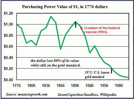
However, the Federal Reserve has a history that is littered with dismal results. The purchasing power of the U.S. Dollar has been reduced by more than 90% since the Fed’s inception in late December of 1913. Since that time, the Federal Reserve has stolen more “real” wealth from the American people than any other institution in the history of mankind.
The Federal Reserve has two primary functions. One function is to maintain price stability or in other words to moderate inflation. Clearly over the past 100 years their inflation track record has been horrific. However, the Fed’s recent track record regarding the value of the U.S. Dollar Index has been dismal the past 15 years as shown below.
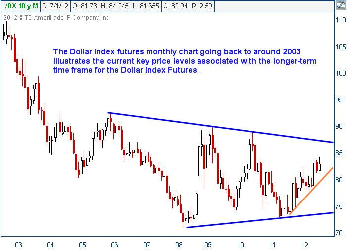
As can be seen clearly above in the Dollar Index Futures monthly chart, at present levels the Dollar’s overall value has diminished well over 31% since late 2001. I would also draw readers’ attention to the selloff that occurred from late 2005 until the early part of 2008. The selloff during that period of time is important to reinforce my next consideration.
Recently the flow of liquidity has primarily been seen in record low interest rates and a surging U.S. equity market. Nearly every day the Dow Jones Industrial Average or the S&P 500 Indexes make a new all-time high. The question that I would like to posit for readers is how long will it be before the so-called smart money starts looking at the attractiveness of commodities relative to equities?
If the Federal Reserve continues to print money at this pace, what will ultimately stop them dead in their tracks? The short answer is energy prices. The easiest way to stop the Fed’s printing press is to see a massive spike in energy prices. While we often hear that history does not repeat but it often rhymes, consider the price action in oil futures during the same 2006 – 2008 selloff in the U.S. Dollar Index.
It is readily apparent that once oil futures were able to push above the $78 / barrel highs in mid-2006, prices exploded while the U.S. Dollar came under strong selling pressure. The timing could not be more impeccable for the explosive nature in the move higher in oil.
Furthermore, if we move forward to present day price action in oil futures we have a large triangle pattern on the long-term charts. The pattern offers the inflation versus deflation argument that so many economists and strategists are plagued by presently in their analysis.
My suggestion is that watching the price of oil futures is likely going to tell us the intermediate expectation by the market of what lies ahead in the inflation versus deflation debate. The movement of oil futures prices in the intermediate term is likely to be based on which direction the triangle pattern ultimately breaks.
What is obvious about this pattern is that a move that could hurdle $100 / barrel will open up a strong move toward $112 – $120 / barrel. If we were to see a move higher in oil futures that could push above the $120 / barrel price level set back in early 2011 a fierce rally in oil futures could play out.
A strong rally in oil futures will ultimately put the final nail in the coffin for U.S. equity markets and the U.S. economy. Gasoline prices would obviously rocket higher and the U.S. economy would quickly be brought to its knees. The Federal Reserve would be forced to either print more money and run the risk of higher oil prices, or do nothing and run the risk that the equity selloff could intensify.
I want to be clear that I am not calling for a rally in oil futures. Price action could go either way depending on market conditions, but the real question is regardless of which way price breaks in the future, how does it help equity markets? Those evil oil speculators run down by politicians seeking air time on television and radio could be the final straw for Ben Bernanke and the Federal Reserve.
Whether the future is full of inflation, deflation, or stagflation I am confident that energy prices will play a critical role in price discovery for not just oil and oil distillates, but for the overall domestic economy.
If the Fed does not show constraint at the appropriate time, oil and other commodity prices are likely to remind Chairman Bernanke that the Federal Reserve’s future track record is likely to be as dire as its historical performance.
Join our FREE Newsletter Today!
The Bible for Commodity Traders....Get our free eBook now!
The sell side analysts and economists are reminding retail investors that risk assets in the United States have been on quite a tear to the upside recently. A correction now lasts a matter of days, if not hours before the bulls push equity prices even higher.
The Federal Reserve is winning the reflation war using cheap money and massive levels of liquidity to help drive risk assets higher and interest rates artificially lower. Unfortunately for domestic investors searching for yield, they find that they are forced to incur higher levels of risk in order to satisfy their growth and income needs. There are significant risks associated with higher than average fixed income returns and the cost will be felt should we see any correction in the future.
However, the Federal Reserve has a history that is littered with dismal results. The purchasing power of the U.S. Dollar has been reduced by more than 90% since the Fed’s inception in late December of 1913. Since that time, the Federal Reserve has stolen more “real” wealth from the American people than any other institution in the history of mankind.
The Federal Reserve has two primary functions. One function is to maintain price stability or in other words to moderate inflation. Clearly over the past 100 years their inflation track record has been horrific. However, the Fed’s recent track record regarding the value of the U.S. Dollar Index has been dismal the past 15 years as shown below.
As can be seen clearly above in the Dollar Index Futures monthly chart, at present levels the Dollar’s overall value has diminished well over 31% since late 2001. I would also draw readers’ attention to the selloff that occurred from late 2005 until the early part of 2008. The selloff during that period of time is important to reinforce my next consideration.
Recently the flow of liquidity has primarily been seen in record low interest rates and a surging U.S. equity market. Nearly every day the Dow Jones Industrial Average or the S&P 500 Indexes make a new all-time high. The question that I would like to posit for readers is how long will it be before the so-called smart money starts looking at the attractiveness of commodities relative to equities?
If the Federal Reserve continues to print money at this pace, what will ultimately stop them dead in their tracks? The short answer is energy prices. The easiest way to stop the Fed’s printing press is to see a massive spike in energy prices. While we often hear that history does not repeat but it often rhymes, consider the price action in oil futures during the same 2006 – 2008 selloff in the U.S. Dollar Index.
It is readily apparent that once oil futures were able to push above the $78 / barrel highs in mid-2006, prices exploded while the U.S. Dollar came under strong selling pressure. The timing could not be more impeccable for the explosive nature in the move higher in oil.
Furthermore, if we move forward to present day price action in oil futures we have a large triangle pattern on the long-term charts. The pattern offers the inflation versus deflation argument that so many economists and strategists are plagued by presently in their analysis.
My suggestion is that watching the price of oil futures is likely going to tell us the intermediate expectation by the market of what lies ahead in the inflation versus deflation debate. The movement of oil futures prices in the intermediate term is likely to be based on which direction the triangle pattern ultimately breaks.
What is obvious about this pattern is that a move that could hurdle $100 / barrel will open up a strong move toward $112 – $120 / barrel. If we were to see a move higher in oil futures that could push above the $120 / barrel price level set back in early 2011 a fierce rally in oil futures could play out.
A strong rally in oil futures will ultimately put the final nail in the coffin for U.S. equity markets and the U.S. economy. Gasoline prices would obviously rocket higher and the U.S. economy would quickly be brought to its knees. The Federal Reserve would be forced to either print more money and run the risk of higher oil prices, or do nothing and run the risk that the equity selloff could intensify.
I want to be clear that I am not calling for a rally in oil futures. Price action could go either way depending on market conditions, but the real question is regardless of which way price breaks in the future, how does it help equity markets? Those evil oil speculators run down by politicians seeking air time on television and radio could be the final straw for Ben Bernanke and the Federal Reserve.
Whether the future is full of inflation, deflation, or stagflation I am confident that energy prices will play a critical role in price discovery for not just oil and oil distillates, but for the overall domestic economy.
If the Fed does not show constraint at the appropriate time, oil and other commodity prices are likely to remind Chairman Bernanke that the Federal Reserve’s future track record is likely to be as dire as its historical performance.
Need A Simple 2-3 Trades Per Week Trading Strategy?
Join our FREE Newsletter Today!
The Bible for Commodity Traders....Get our free eBook now!
Thursday, March 28, 2013
Gold vs. S&P 500 – Where is the Value?
This past week we received the final 4th Quarter GDP number which came in at 0.39%. The total 4th Quarter growth was terrible, plain and simple. Based on the performance in the equity markets that we have seen thus far in the 1st Quarter of 2013 investors would expect strong GDP growth. However, the only thing spurring stock market growth is the constant humming of Ben Bernanke’s printing press.
The real economy and the stock market are no longer strongly correlated. Essentially, they are meaningless. How do you evaluate risk when Treasury linked interest rates are artificially being held down by the Federal Reserve? How do you evaluate earnings growth estimates when most government based statistics are manipulated or “smoothed” to perfection?
My final argument to anyone who is a true believer that the stock market is representative of the economy is a very simple premise. If the stock market is the economy, how does the stock market evaluate small business earnings growth when most small businesses are not publicly traded? It is a simple question, but I have yet to find a sell side analyst that can work around it with facts......Read More.
Get our Free Trading Videos, Lessons and eBook today!

The real economy and the stock market are no longer strongly correlated. Essentially, they are meaningless. How do you evaluate risk when Treasury linked interest rates are artificially being held down by the Federal Reserve? How do you evaluate earnings growth estimates when most government based statistics are manipulated or “smoothed” to perfection?
My final argument to anyone who is a true believer that the stock market is representative of the economy is a very simple premise. If the stock market is the economy, how does the stock market evaluate small business earnings growth when most small businesses are not publicly traded? It is a simple question, but I have yet to find a sell side analyst that can work around it with facts......Read More.
Get our Free Trading Videos, Lessons and eBook today!
Wednesday, August 15, 2012
AAPL Trade Considerations for Option Expiration Week
Option trading is not “just the same as stocks.” It turns on the three primal forces ruling an options trader’s world....time to expiration, price of the underlying, and implied volatility.
As expiration approaches, the forces of time exert their strongest influence of the cycle on a trader’s positions. In today’s blog, written as August expiration is but a few days away, I want to call attention to some of the practical considerations traders would be well advised to incorporate into their trading plan.
Pundits have long cited the aphorism that there are only two sure things in life, death and taxes. Options traders must incorporate a third inevitability, the time component (aka the extrinsic component) of an option premium goes to zero at the closing bell of options expiration. This occurrence is neither negotiable nor avoidable and it occurs with clockwork like precision.
A recent change to the market has introduced an important new element to the long standing monthly expiration cycle. The tremendous popularity of weekly options has rendered every Friday the end of an expiration cycle.
It is critically important to recognize this new phenomenon because it allows tailoring of strategies to fit more precisely the anticipated time frame in which the trader’s hypotheses play out.
Let us consider some of the practical implications of this cyclical pattern. I have discussed before in this blog the fact that erosion of time premium is not linear across the life of an option but accelerates dramatically as expiration approaches. Expiration week is where this acceleration reaches its greatest pace as it heads to zero at Friday’s closing bell.
What is often not immediately understood by the new option trader is the radical change in the risk / reward ratio of a trade produced by this erosion. Consider a simple one legged trade. A trader who was bullish on AAPL during the price weakness in late July could have chosen to sell naked puts to reflect his price view. The graph below shows the trade of selling short the August 545 strike put at mid day on Thursday July 26 with 23 days to expiration:
The trader would have taken a credit of around $425 for each contract he sold on this trade with a probability of success of 84%. The trade could have been closed last Friday for $16/contract locking in $409 per contract less commission.
While the probability of AAPL trading below the 545 strike as August expiration approaches is close to 0, it is not O. To accept the risk of a Black Swan event occurring in order to capture the remaining 3.8% of the initial credit is not smart trading. The general rule of thumb I follow in this type of trade is to close or roll up the position to a higher strike when 80% of the initial credit received has been captured.
Perhaps the most nuanced effect of time to expiration is seen in the behavior of the butterfly trade construction. To review briefly, remember that the classic butterfly is constructed in either calls or puts and consists of both a debit and a credit spread which share the same short strike.
Butterfly positions have the interesting characteristics of responding only minimally if at all to price movement when far out in time from expiration. These same trade structures will react violently to price movement when little time to expiration remains.
An example could be constructed during the July AAPL price rout. Let us assume a trader was sufficiently prescient to predict the price recovery. In order to capture this hypothesized movement, he could have purchased the August 605/-625/645 in a (+1/-2/+1 standard butterfly ratio) call butterfly spread on July 26th. This trade structure is a defined risk position where the maximum risk is the cost of entering the position.
This position would have been very inexpensive because of two factors:
1. Implied volatility was elevated, rendering the butterfly cheap.
2. The center strike where the options were sold short and the point of the theoretical maximum profitability had less than a 5% chance of being in-the-money.
The P&L graph for this position at the time of entry is presented below:
Several practical points bear emphasis. First, the maximum potential profit from this low probability trade is in excess of 1800%. This trade construction which cost around $100 per spread at the time could have been closed last Friday for a profit of over $850 per spread.
Second and the point germane to today’s discussion is the behavior of the trade with regard to time. Notice that the broken lines, representing intermediate time points in the trade achieve nowhere near the full profit potential that exists when expiration arrives.
However, not to be missed is the fact that the range of profitability narrows dramatically as expiration is approached. It is for this reason that most experienced butterfly traders remove profitable trades before their wild relationship to price is activated as expiration gets quite close.
I want to be very clear about this demonstrated butterfly trade. This is not a typical trade I would enter because of its low probability of success. I present it as a purely educational exercise to demonstrate the behavior of these frequently encountered trade structures.
I invite you to try my service to follow my trades and understand how the nuanced behavior of options can be used to deliver highly profitable trades.
Happy Trading!
Want my simple ONE trade per week trading strategy?
Just click here to join me at Options Trading Signals today and enjoy a 14 day FREE trial!
As expiration approaches, the forces of time exert their strongest influence of the cycle on a trader’s positions. In today’s blog, written as August expiration is but a few days away, I want to call attention to some of the practical considerations traders would be well advised to incorporate into their trading plan.
Pundits have long cited the aphorism that there are only two sure things in life, death and taxes. Options traders must incorporate a third inevitability, the time component (aka the extrinsic component) of an option premium goes to zero at the closing bell of options expiration. This occurrence is neither negotiable nor avoidable and it occurs with clockwork like precision.
A recent change to the market has introduced an important new element to the long standing monthly expiration cycle. The tremendous popularity of weekly options has rendered every Friday the end of an expiration cycle.
It is critically important to recognize this new phenomenon because it allows tailoring of strategies to fit more precisely the anticipated time frame in which the trader’s hypotheses play out.
Let us consider some of the practical implications of this cyclical pattern. I have discussed before in this blog the fact that erosion of time premium is not linear across the life of an option but accelerates dramatically as expiration approaches. Expiration week is where this acceleration reaches its greatest pace as it heads to zero at Friday’s closing bell.
What is often not immediately understood by the new option trader is the radical change in the risk / reward ratio of a trade produced by this erosion. Consider a simple one legged trade. A trader who was bullish on AAPL during the price weakness in late July could have chosen to sell naked puts to reflect his price view. The graph below shows the trade of selling short the August 545 strike put at mid day on Thursday July 26 with 23 days to expiration:
The trader would have taken a credit of around $425 for each contract he sold on this trade with a probability of success of 84%. The trade could have been closed last Friday for $16/contract locking in $409 per contract less commission.
While the probability of AAPL trading below the 545 strike as August expiration approaches is close to 0, it is not O. To accept the risk of a Black Swan event occurring in order to capture the remaining 3.8% of the initial credit is not smart trading. The general rule of thumb I follow in this type of trade is to close or roll up the position to a higher strike when 80% of the initial credit received has been captured.
Perhaps the most nuanced effect of time to expiration is seen in the behavior of the butterfly trade construction. To review briefly, remember that the classic butterfly is constructed in either calls or puts and consists of both a debit and a credit spread which share the same short strike.
Butterfly positions have the interesting characteristics of responding only minimally if at all to price movement when far out in time from expiration. These same trade structures will react violently to price movement when little time to expiration remains.
An example could be constructed during the July AAPL price rout. Let us assume a trader was sufficiently prescient to predict the price recovery. In order to capture this hypothesized movement, he could have purchased the August 605/-625/645 in a (+1/-2/+1 standard butterfly ratio) call butterfly spread on July 26th. This trade structure is a defined risk position where the maximum risk is the cost of entering the position.
This position would have been very inexpensive because of two factors:
1. Implied volatility was elevated, rendering the butterfly cheap.
2. The center strike where the options were sold short and the point of the theoretical maximum profitability had less than a 5% chance of being in-the-money.
The P&L graph for this position at the time of entry is presented below:
Several practical points bear emphasis. First, the maximum potential profit from this low probability trade is in excess of 1800%. This trade construction which cost around $100 per spread at the time could have been closed last Friday for a profit of over $850 per spread.
Second and the point germane to today’s discussion is the behavior of the trade with regard to time. Notice that the broken lines, representing intermediate time points in the trade achieve nowhere near the full profit potential that exists when expiration arrives.
However, not to be missed is the fact that the range of profitability narrows dramatically as expiration is approached. It is for this reason that most experienced butterfly traders remove profitable trades before their wild relationship to price is activated as expiration gets quite close.
I want to be very clear about this demonstrated butterfly trade. This is not a typical trade I would enter because of its low probability of success. I present it as a purely educational exercise to demonstrate the behavior of these frequently encountered trade structures.
I invite you to try my service to follow my trades and understand how the nuanced behavior of options can be used to deliver highly profitable trades.
Happy Trading!
Want my simple ONE trade per week trading strategy?
Just click here to join me at Options Trading Signals today and enjoy a 14 day FREE trial!
Labels:
AAPL,
Apple,
expiration,
J.W. Jones,
options,
Trading Options Signals
Monday, July 30, 2012
The Federal Reserve, Gold, Crude Oil and the Dollar’s Demise
The Federal Reserve through its various monetary mechanisms has a major impact on the value of the U.S. Dollar and over time has destroyed the purchasing power of the fiat base currency used in the United States.
Interestingly enough, the following quote comes directly from the Federal Reserve’s website regarding one of its primary mandates, “In setting monetary policy, the Committee seeks to mitigate deviations of inflation from its longer-run goal and deviations of employment from the Committee’s assessment of its maximum level.”
The chart below illustrates the horrific job the Federal Reserve has done of protecting the purchasing power of the U.S. Dollar since its creation.
In light of the longer-term malaise seen above, the Dollar Index futures have recently rallied sharply higher as Europe continues to flail in a slow and agonizing decline which will ultimately lead to a complete fiscal disaster.
Sovereign debt concerns continue to mount regardless of what the European technocrats spew publicly and the U.S. Dollar has been the primary beneficiary of these seemingly growing concerns.
This brings me to the purpose of this article. Most of the articles I write are focused on option based trades, but I decided it was time to put forth a more comprehensive scenario that could unfold over the next few years as a result of excessive monetary stimulus through various quantitative easing mechanisms developed by the Federal Reserve Bank. “A mild change” to say the least . . .
As discussed above, the U.S. Dollar Index futures have moved higher throughout most of 2012. Any significant increase in the U.S. Dollar is a growing concern among central bankers as it correlates toward deflation. Deflation is the Fed’s biggest enemy, besides themselves of course.
Next week the Federal Reserve will release statements relating to the economic condition of the United States. Furthermore, the Fed also will discuss if it will initiate another dose of monetary crack for a capital market place that is addicted to cheap money and zero interest rates. At this point, the so-called marketplace is the antithesis of free by all standard measures.
Consider the long-term monthly chart of the U.S. Dollar Index futures illustrated below:
The U.S. Dollar Index futures are in an uptrend that dates back to mid 2011. The orange line illustrates the uptrend and represents a key price level for the U.S. Dollar Index. For those unfamiliar with basic technical analysis, the rising orange trendline will act as buying support until the Dollar eventually breaks down through it signaling the bullish move higher has ended.
This brings us to a rather interesting potential observation. Today Mario Draghi, Chairman of the European Central Bank (ECB), made public comments regarding the readiness of the ECB to act if need be to safeguard the European Union. The Dollar Index Futures plummeted on the statement and remained under selling pressure most of the trading session on Thursday.
If a mere comment from the ECB can have such a damaging impact on the valuation of the Dollar, what would happen to the Dollar if the Fed initiated a new easing mechanism?
The answer is simple, the U.S. Dollar would immediately be under selling pressure. Selling pressure in the U.S. Dollar Index generally leads to a rally in risk assets such as equities and oil futures. Over the longer-term, a weak Dollar is also positive for precious metals and other hard assets.
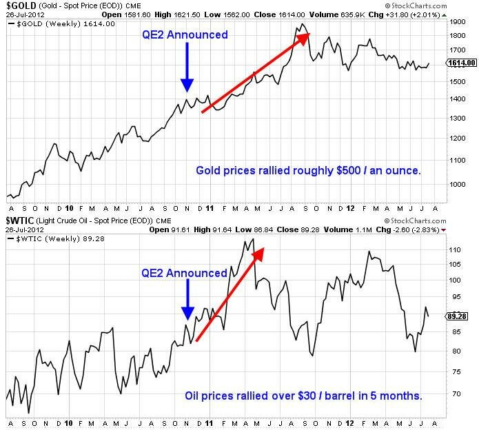
As an example to illustrate the power of Quantitative Easing as it relates to the price of both gold and oil, consider the following chart:
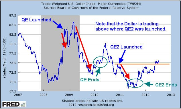
Obviously the price action is pretty clear that Quantitative Easing has a positively correlated impact on the price performance of hard assets, specifically gold and oil. Now consider a price chart of the Dollar Index shown below courtesy of the Federal Reserve Bank, the annotations are mine.
The chart above tells an interesting story about the impact that Quantitative Easing has on the Dollar. How can the Federal Reserve claim to be protecting the purchasing power of the U.S. Dollar when its actions have a direct negative correlation to the greenback’s price?
Furthermore, based on the chart above I am of the opinion that Quantitative Easing III is a foregone conclusion. The current price of the Dollar Index is clearly above the previous high where QE2 was launched. So far, the rally in the Dollar Index has not pushed equity prices considerably lower. However, should the Federal Reserve refrain from initiating additional easing measures it is likely based on the chart above that the U.S. Dollar Index will rally.
Upon the conclusion of both QE and QE2, the Dollar Index rallied sharply higher. With the Fed announcement coming closer by the hour, financial pundits will attempt to predict the future action of the Fed.
I have no interest in making predictions about what the Fed will do. It is a certainty that QE3 will take place at some point in the future whether it be sooner or later. The Federal Reserve simply has no choice, otherwise the Dollar would continue to rally and we would begin to go through a deflationary period which the Federal Reserve simply cannot tolerate.
The scenario that I would urge inquiring minds to consider would be as follows. If the Fed does nothing we can likely assume that the U.S. Dollar Index will continue to rally to the upside. Based on the price chart of the U.S. Dollar Index shown above, we can expect that sellers would certainly step in around the 86 – 88 price range based on previous resistance.
If the U.S. Dollar makes it anywhere near the 86 – 88 price range without the Federal Reserve initiating QE3 it would be expected that risk assets would be under considerable selling pressure somewhere along the way. Should the Fed act to break the Dollar’s rally either through more easing or “other” mechanisms, the result would be a potentially monster rally for risk assets, at least initially.
Equities, oil, and precious metals would rally on a falling Dollar as shown above. The question then becomes what if this is the last gasp rally before a monster selloff ensues in the Dollar Index?
If the Fed breaks the rally early or initiates a monster-sized easing program, the initial reaction will be quite positive, especially for equities. As the selloff in the Dollar Index worsens, equities would eventually begin to underperform as oil prices would surge putting pressure on the economy.
In addition to oil rallying on the weaker Dollar, we could also see sellers start to show up in droves dumping U.S. Treasury’s to any buyer left standing. International debt holders would especially have incentive to sell Treasury’s as the real purchasing power of the bonds’ interest payments would decline as the Dollar fell in value.
The way I see it, whether the Fed launches QE3 now or later, the outcome will not change. An extremely weak Dollar could wreak havoc across a variety of assets and the broader economy. Imagine where gasoline prices would be if oil prices hit $125 / barrel. The average price in the U.S. would be well above $5 / gallon based on current prices and possibly higher.
What happens to the economy if interest rates start to react violently to the price action in the Dollar? What if Treasury’s start to sell off viciously and interest rates start to rise wildly and volatility among bond holdings runs rampant? Are we to believe that the very entity that has created boom and bust cycles through easy monetary policies and has been oblivious to the bubbles that it has created is capable of solving the issues that would potentially arise from a currency crash in the U.S. Dollar?
The track record of the Federal Reserve is quite clear. They are generally late to the party and rarely are able to forecast events in the future with any clarity. Do you really think they will know what to do? The free market wants to destroy debt through deflationary pressure and price discovery and the Federal Reserve continues to get in the way.
The free market will win as it always does, but the American people will lose. This process may take months, years, or even decades to play out. Eventually the game will end. There is only one certainty should any portion of the scenario discussed above come to fruition, when the Dollar is inevitably broken the only safe place to hide during the potential currency crash will be in physical gold and silver. Paper money and paper assets will come under extreme selling pressure and in some cases will simply........disappear.
Here’s to hoping I am totally wrong!
Test drive our video analysis and trade idea service for only $1 at www.Trader Video Playbook.com
Get our Free Trading Videos, Lessons and eBook today!
Labels:
Chris Vermeulen,
Crude Oil,
Dollar,
Federal Reserve,
J.W. Jones,
QE,
QE2,
QE3,
resistance,
Trader Video Playbook
Wednesday, July 18, 2012
The Passage of Time Leads to Profitability for Option Traders
From J.W. Jones at Options Trading Signals.......
J.W is talking greek today. And we never miss a chance to hear what he is thinking about using options to play Delta or Theta in this market.
My most recent missive discussed some of the nuances of the options Greek, Delta which deals with the change in option price with regard to changes in price of the underlying. Today I would like to examine some of the practical details surrounding the second of the primal forces describing the behavior of options with regard to the passage of time. This second Greek is Theta.
As opposed to the value of a stock position which varies only in relation to changes in price, options are subject to changes in value as a result of the interplay of three factors: price of the underlying, time to expiration, and implied volatility.
Before we delve into describing the operational characteristics of Theta, we need to talk about the anatomy of an options price. Although it is quoted as a single bid / ask pair of quotes, the options price reflected on your quote screen actually consists of the sum of two components – the extrinsic and the intrinsic value of the option in question.
The intrinsic value of an option is that portion of the option that has value by virtue of the current stock price. For example, AAPL currently trades around $607 / share as I write this. The August 600 strike call trades at around $27.00. The intrinsic value portion of that premium is ($607-$600 = $7).
Intrinsic values of a given option can vary from essentially the entirety of the option value for a "deep in the money" option to $0 for an "out of the money option". In our AAPL example, the "out of the money" strike of $610 sells for $22 and contains $0 of intrinsic value.
Read the entire article > The Passage of Time Leads to Profitability for Option Traders
J.W is talking greek today. And we never miss a chance to hear what he is thinking about using options to play Delta or Theta in this market.
My most recent missive discussed some of the nuances of the options Greek, Delta which deals with the change in option price with regard to changes in price of the underlying. Today I would like to examine some of the practical details surrounding the second of the primal forces describing the behavior of options with regard to the passage of time. This second Greek is Theta.
As opposed to the value of a stock position which varies only in relation to changes in price, options are subject to changes in value as a result of the interplay of three factors: price of the underlying, time to expiration, and implied volatility.
Before we delve into describing the operational characteristics of Theta, we need to talk about the anatomy of an options price. Although it is quoted as a single bid / ask pair of quotes, the options price reflected on your quote screen actually consists of the sum of two components – the extrinsic and the intrinsic value of the option in question.
The intrinsic value of an option is that portion of the option that has value by virtue of the current stock price. For example, AAPL currently trades around $607 / share as I write this. The August 600 strike call trades at around $27.00. The intrinsic value portion of that premium is ($607-$600 = $7).
Intrinsic values of a given option can vary from essentially the entirety of the option value for a "deep in the money" option to $0 for an "out of the money option". In our AAPL example, the "out of the money" strike of $610 sells for $22 and contains $0 of intrinsic value.
Read the entire article > The Passage of Time Leads to Profitability for Option Traders
Thursday, June 28, 2012
Using Standard Deviation & Probability to Trade Options
From guest blogger J.W. Jones.....
I recently discussed the ability to use implied volatility to calculate the probability of a successful outcome for any given option trade. To review briefly, the essential concepts a trader must understand in order to make use of this helpful metric include......
The prices of any given underlying can be considered to be distributed in a Gaussian distribution the classic bell shaped curve.
The width of the spread of these prices is reflected in the standard deviation of the individual underlying’s distribution curve.
Plus / minus one standard deviation from the mean will include 68% of the individual price points, two standard deviations will include 95%, and three standard deviations will include 99.7%
A specific numerical value for the annual standard deviation can be calculated using the implied volatility of the options using the formula: underlying price X implied volatility
This standard deviation can be adjusted for the specific time period under consideration by multiplying the value derived above by the square root of the number of days divided by 365
These derived values are immensely important for the options trader because they give definitive metrics against which the probability of a successful trade can be gauged. An essential point of understanding is that the derived standard deviation gives no information whatsoever on the direction of a potential move. It merely determines the probability of the occurrence of a move of a specific magnitude.
Here's J.W.'s complete post and charts for "Using Standard Deviation & Probability to Trade Options"
I recently discussed the ability to use implied volatility to calculate the probability of a successful outcome for any given option trade. To review briefly, the essential concepts a trader must understand in order to make use of this helpful metric include......
The prices of any given underlying can be considered to be distributed in a Gaussian distribution the classic bell shaped curve.
The width of the spread of these prices is reflected in the standard deviation of the individual underlying’s distribution curve.
Plus / minus one standard deviation from the mean will include 68% of the individual price points, two standard deviations will include 95%, and three standard deviations will include 99.7%
A specific numerical value for the annual standard deviation can be calculated using the implied volatility of the options using the formula: underlying price X implied volatility
This standard deviation can be adjusted for the specific time period under consideration by multiplying the value derived above by the square root of the number of days divided by 365
These derived values are immensely important for the options trader because they give definitive metrics against which the probability of a successful trade can be gauged. An essential point of understanding is that the derived standard deviation gives no information whatsoever on the direction of a potential move. It merely determines the probability of the occurrence of a move of a specific magnitude.
Here's J.W.'s complete post and charts for "Using Standard Deviation & Probability to Trade Options"
Monday, April 30, 2012
Why the U.S. Dollar is Critical for the S&P 500 Index this Week
Recently I have been advising members of my service to be cautious as the market appears to be at a major crossroads. The U.S. Dollar Index is on the verge of a major breakdown. If a breakdown occurs it will be clear that the Federal Reserve will have officially stopped any potential rise in the U.S. Dollar. Over the past few months the Dollar has been producing a series of higher highs and higher lows, however the current cycle may break the pattern as can be seen below.
If the U.S. Dollar pushes down below the recent lows and we get continuation to the downside, we will break the recent bullish pattern. Furthermore, if the Dollar starts to weaken it should benefit equities and other risk assets such as oil. Higher energy prices would not be long term bullish for equity markets so there is concern if the Dollar really starts to extend lower.
However, if the Dollar finds a bottom and rallies it clearly would create a headwind for equities. We should know whether we have a major breakdown on the daily chart in the next few weeks. Until then, the Dollar could go either way and obviously the price action in the Dollar will have a major impact on risk assets and stock market returns in the near future.
From a macroeconomic viewpoint, risk assets such as the S&P 500 Index could be in trouble in the months ahead. U.S. gross domestic product (GDP) came in lower than expected with revisions likely in the near future. Unemployment claims appear to have bottomed and are rising week after week even though the major media fails to report it appropriately as it would appear that the Bureau of Labor Statistics has stumped media pundits with data revisions.
Additionally, there are two other macroeconomic data points which need to be mentioned. The Citigroup Economic Surprise Index has moved below zero and is showing a negative reading. This index is generally a leading indicator regarding equity prices and the recent decline shown below is problematic for the bullish case.
As can be seen above, fundamental data is starting to skew towards the downside which is likely a result of the recession that is in the process of developing over in Europe and potentially in China. Time will tell if the index can reverse, but the bulls need to see a major reversal in the near future.
The chart below illustrates the relationship between metal prices and industrial productivity. Demand for metal increases when economies are expanding and prices generally contract when economies retract. The chart below demonstrates global metal demand. The chart speaks for itself.
Clearly if industrial production contracts (reduction in Global Manufacturing PMI) the impact on the global economy will be felt across multiple countries’ economies. The chart below illustrates the MSCI World Index compared to global manufacturing PMI. Similarly to the chart above, this chart also tells a significant story about what investors and traders should expect if the PMI numbers come in light against expectations.
As quoted from the zerohedge.com article entitled, What do Metal Prices Tell us About the Future of the Stock Market, “In other words, for those who still believe in logical, causal relationships (even in a time of ubiquitous central planning) unless something drastically changes to push fundamental demand of metals higher, one could say the the outlook for equities is not good.”
Essentially, the data shown above is certainly not bullish in the intermediate to longer term. However, it generally takes time for macroeconomic data to permeate all the way through to equity markets. For right now, the story regarding global growth is at the very least questionable based on the data illustrated above.
In the short term anything is seemingly possible. The S&P 500 Index closed above the key 1,400 price level on Friday. I would not be shocked to see prices extend up to the recent highs near 1,420. Ultimately I think we are in a long term topping formation that might require another higher high up to around 1,440 before we see a deeper correction.
The past few weeks have produced a very mild correction compared to the monster rally we have seen since October of 2011. This is a bullish signal, but we need to see prices continue higher and climb a serious “wall of worry” that is coming out of a variety of places. The European situation continues to worsen overall and we have lower than expected GDP numbers in the US paired with concerns about growth in China.
The S&P 500 has some negative headlines to deal with, but so far it has been able to shrug off poor economic data and we could see an extension higher that would shake out the shorts and run stops above the recent highs. However a move lower remains possible. The daily chart of the S&P 500 illustrates the recent correction and the 1,420 highs.
I believe that the next few weeks are going to be critical and the S&P 500 may trade in a consolidation zone between recent lows and the 1,420 highs while traders await more economic data. Fundamental data is starting to indicate that a slow down may be beginning. In contrast, the topping pattern that we appear to be carving out may require higher prices to suck in more longs before moving into a deeper correction.
In the short run, the Dollar will likely hold clues regarding the immediate future for risk assets. However, the longer term picture for equities is quite murky based on the economic data points we are seeing paired with additional concerns stemming from the European sovereign debt crisis. Right now I am looking at time decay based strategies in the near term and will likely stay away from directional biased trades. I would urge readers to be cautious regardless of which direction they favor.
Looking for a Simple ONE Trade Per Week Trading Strategy?
If So Join Option Trading Signals today with our 14 Day Trial
J.W. Jones
Friday, March 30, 2012
Option Trading: A Basic Explanation of Debit Spreads
Welcome back to the world of options. My reality exists in three dimensions and far more combinations of potential positions than does the one-dimensional world of the stock trader.
The view from my turret is ruled by the three primal forces of options — time to expiration, price of the underlying, and implied volatility. Consider for a moment the fact that each of these factors can independently impact a given option.
Multiply this by several available expiration dates and strike prices; add in the fact that individual option positions can include a variety of short and long positions at different strikes and expirations, and the potential combinations that make up an option position in a single underlying can approach a very large number.
For those traders first beginning to navigate this unfamiliar world, I think it is important to understand trade selection is manageable. There are certain families of trades that are unified by similar characteristics.
It is important to become familiar with the various trade constructions available to the knowledgeable options trader. Grouping the potential trades into related groups dramatically reduces the number of trade setups you must consider before entering a new trade.
If you are familiar with the various trade constructions, it makes discussion of a specific family member whom we may consider for employment in a trade far easier to understand.
Description of the family characteristics will take a little time, but it forms the framework on which we can hang the individual trades we will discuss in future postings.
I want readers to begin to become familiar with these patterns because it is these families of multi-legged option trades that we will return to on a regular basis to consistently perform for us.
Let me begin discussion of the various families by pointing out the redheaded stepchild of the trade constructions available. This family member, the single-legged position of being long either a put or call, is not completely without utility.
The reason for its seldom use is that for the knowledgeable options trader, this position rarely represents the best risk / reward structure given the variety of available trade constructions.
One basic and important family is that of the vertical spread. We will return several times to this family not only because of its utility in its basic form, but also because these spreads form the basic building blocks for more advanced spreads such as butterflies and iron condors.
The basic vertical spread is constructed by both buying and selling an option of the same type, either puts or calls, within the same expiration series. This is a directional spread with one breakeven point that reaches maximum profitability at expiration or when the spread has moved deep in-the-money.
It has a defined maximum profit and defined maximum loss when established. The spread is used to trade directionally in a capital efficient manner and largely neutralizes impacts of changes in implied volatility.
There are four individual vertical spread family members — the call debit spread, the call credit spread, the put debit spread, and the put credit spread. Each has its distinct and defining construction pattern. These are not the only names by which these spreads are known. Trying to keep independent option traders confined to a single set of terminologies is like trying to herd cats — it is not going to happen.
For this reason, the additional confusing and duplicative names for these spreads include bull call spread, bear call spread, bear put spread, and bull put spread. To make matters even more confusing, traders often refer to “buying a call spread” or “selling a put spread.” This multiplicity of names for the same trade structure is mightily confusing to those getting used to my world.
I am a visual learner and find that a picture is worth well more than the often cited thousand words. When I review in my mind the various option families available to use in trade construction, I think of the characteristic family portrait of each as displayed in the profit and loss, or P&L, curve.
Attached below is the first in our series of family portraits, but remember within this framework is abundant room for individual variation.
We will see trades displayed in this format with many variations as we meet the different families. The solid red line represents the profit or loss at expiration. The dotted line represents the P&L curve today and the dashed line the curve halfway to options expiration from today.
In future articles I will discuss other trade constructions that are regularly employed by experienced option traders. Until then, be sure to manage your risk accordingly.
In 2012 subscribers of my options trading newsletter have won 12 out of 13 trades. That’s a 92% win rate, pocketing serious gains with the trades focusing only on low risk credit spread options strategies.
If you are looking for a simple one trade per week trading style then be sure to join Option Trading Signals.com today with our 14 Day Trial
Tuesday, February 14, 2012
Two Short Term Scenarios for the S&P 500 Index
For the first time since the last week of December of 2011, the S&P 500 Index closed lower on the weekly chart. Recently I have been discussing the overbought nature of stocks based on a variety of indicators. However, the real question that should be asked is whether last week was just a short term event or if we see sustained selling in coming weeks.
The issues occurring in Greece spooked the markets somewhat on Friday as Eurozone fears continue to permeate in the mindset of traders. The U.S. Dollar Index is the real driver regarding risk in the near and intermediate term future. If the Dollar is strong, market participants will likely reduce risk. However a weakening Dollar will be a risk-on type of trading event which could lead to an extended rally in equities, precious metals, and oil.
Friday marked an important day for the U.S. Dollar Index futures as for the first time in several weeks the Dollar held higher prices into a daily close. The U.S. Dollar appears to have carved out a daily swing low on the daily chart from Friday. Furthermore, the potential for a weekly swing low at the end of this week remains quite possible. The chart below illustrates how the 100 period simple moving average has offered short term support for the past few weeks.
U.S. Dollar Index Futures Daily Chart
I would also point out that the MACD is starting to converge which is a bullish signal and the full stochastics are also demonstrating a cross on the daily time frame. As long as the 100 period moving average holds price, a rally is likely in the U.S. Dollar Index in coming weeks.
Should that rally play out, it will likely push risk assets lower. My primary target for the S&P 500 would be around the 1,300 – 1,310 price range if the selloff transpires. It is important to note that headlines coming out of Europe could derail this analysis in short order.
Assuming that a selloff in the S&P 500 occurs it will present a difficult trading environment for market participants. Market participants are going to be in a tough position around the 1,300 price level. A rally from 1,300 could serve to test the 2011 highs. In contrast, a confirmed breakdown of the 1,300 price level could initiate a more significant selloff towards the 1,250 area.
Should price move towards the 1,300 price level the bulls and bears will be battling it out for intermediate control of price action. This is my preferred scenario for the short term time frame, but I would only give it about a 60% chance of success at this point in time. We simply need more time to see how price action behaves the first few session of the forthcoming week.
S&P 500 Index Bearish Scenario
The alternate scenario which has about a 40% chance of success would be a sharp rally higher which likely would be produced by news coming out of Greece and/or the Eurozone that pushes the Euro higher. Right now risk is high due to the sensitivity of price to headline risk. With that said, the bullish alternative scenario is shown below.
S&P 500 Index Bullish Scenario
At this point we just do not have enough price information to give us clarity regarding the most probable outcome. The price action in the Euro is going to drive price action for the S&P 500 and other risk assets in weeks ahead.
Anything is possible in the short term, but I have to give a slight edge to the bears simply based on the price action Friday and the fact that almost every indicator I follow is screaming that the equities market is severely overbought. The price action this week should be telling. Headline risk is excruciatingly high, trade safely in the coming week!
By: Chris Vermeulen – Get Chris' FREE Weekly ETF Reports & Analysis
Co-Author: JW Jones – Get J.W.s FREE Weekly Options Reports & Analysis
Labels:
Chris Vermeulen,
Dollar,
Eurozone,
Greece,
Index,
J.W. Jones,
SP 500
Tuesday, February 7, 2012
Was Friday’s Price Action in Gold Signaling a Top in the S&P 500?
Friday morning traders and market participants awaited the key January employment report from the U.S. Bureau of Labor Statistics. The reaction to the supposedly wonderful report was a surge in the S&P 500 E-Mini futures contracts as well as several other key equity index futures.
The overall tenor among the financial punditry was predictable as wildly bullish predictions permeated the morning session on CNBC and in the financial blogosphere. However, after the report had been out for several hours notable independent voices such as Lee Adler of the Wall Street Examiner came out with information that suggested the numbers were an apparition of manipulated statistics.
I am not going to spend a great deal of time discussing the report, but the reaction to the news was decisively bullish on Friday. The question I want to know is whether Friday was a blow off top? In the recent past the S&P 500 has seen several key inflection points and intermediate-term tops form on non-farm payroll monthly announcements.
I follow a variety of indicators to help me decipher more accurately when the market is getting overbought or oversold. For nearly two weeks the market has been extremely overbought, but now we are reaching truly astonishing levels. The following charts represent just a few signals that the market is due for a pullback and a top is likely approaching.
Percentage of NYSE Stocks Trading Above Their 50 Period Moving Average
The chart above clearly illustrates that as of Friday’s closing bell (02/03) over 89% of stocks were trading above their 50 period moving averages. Consequently that reading is one of the highest levels that we have seen in the past 3 years. In addition, over 73% of stocks that trade on the NYSE are currently priced above their longer term 200 period moving averages. Another extremely overbought signal.
S&P 500 Bullish Percent Index Weekly Chart
The S&P 500 Bullish Percent Index is another great tool for measuring the overall position of the S&P 500. It is without question that the longer term time frame is reaching the highest level of overbought conditions in the past 3 years.
McClellan Oscillator Divergence with S&P 500 Price Action
The two charts shown above present an interesting situation regarding the divergence in the McClellan Oscillator and the price action in the S&P 500. The most recent example of this type of divergence occurred in October of 2011 and prices immediately reversed to the upside after several months of selling pressure. In fact, this correlation between reversals in the S&P 500 and divergences in the McClellan Oscillator works relatively well historically.
Clearly there are bullish voices arguing for the 2011 S&P 500 Index high of 1,370.58 to be taken out to the upside in the near future. Additionally, several market technicians in the blogospere have been pointing to the key resistance range between 1,350 and 1,370 on the S&P 500 as a likely price target. Obviously if those price levels are met strong resistance is likely to present itself. However, as a contrarian trader I have found that the more obvious price levels are the more likely it is that they either will not be tested or they will not offer significant resistance.
It is obvious that Chairman Bernanke and the Federal Reserve have embarked on a massive fiat currency printing campaign which has helped buoy risk assets to the upside. Through a combination of reducing interest rates on safety haven investments like Treasury’s and CD’s, the Federal Reserve has forced conservative investors and those living on a fixed income into riskier assets in search of yield.
This process helps elevate stock prices and creates the desired outcome for the Federal Reserve which involves the perception by average individuals that they are wealthier. The Fed calls this the “wealth effect” and they seem poised to insure that U.S. financial markets continue to ride upon a see of cheap money and liquidity.
Ultimately the Federal Reserve’s most recent announcements have served to help flatten the short end of the yield curve further while providing a launching pad for equities and precious metals. However, issues persisting in Europe could have an adverse impact on the short to intermediate term price action of the U.S. Dollar.
Right now everywhere I look I hear market prognosticators commenting on how hated the U.S. Dollar is and how Chairman Bernanke will not allow the Dollar to appreciate markedly in order to protect U.S. exports and financial markets. I think that the Dollar has the potential to rally in the short to intermediate term. Right now the U.S. Dollar Index appears to be trying to form a bottom.
U.S. Dollar Index Daily Chart
Obviously there is good reason to believe that the U.S. Dollar Index could reverse to the upside here. Whether it would have the strength to take out recent highs is unclear, but a correction to the upside not only seems unexpected by most market participants, but it seems plausible based on the weekend news coming out of Greece.
Monday morning the Greek government is set to determine if they will agree to the demands of the Troika in exchange for the next tranche of bailout funds. If the Greek government and the Troika do not come to an agreement, the Euro could sell-off violently.
Additionally there are already concerns about the next LTRO offering from the European Central Bank. The measure is to help provide European banks with additional liquidity, but there are growing concerns that the size and scope of the LTRO could have a dramatic impact on the Euro’s valuation against other currencies. Time will tell, but there are certainly catalysts which could help drive the U.S. Dollar higher.
Another potential indicator that the Dollar could see higher prices in coming days was the largely unnoticed bearish price action on Friday of precious metals. Both gold and silver have been on a tear higher over the past several weeks. Both precious metals have surged since the Federal Reserve announced that interest rates would remain near zero on the short end of the curve through 2014.
However, on Friday gold and silver were both under extreme selling pressure. The move did not get much attention by the financial media. The price action in gold and silver on Friday could be another indication that the U.S. Dollar is set to rally. The daily chart of gold is shown below.
Gold Futures Daily Chart
Obviously the reversal on Friday in gold futures was sharp. The move represented nearly a 2% decline for the session on the price of gold. However, as long term readers know I am a gold bull. I just do not see how gold and silver do not rally in the intermediate to longer term based on the insane levels of fiat currency printing going on at all of the major central banks around the world. The macro case for gold is very strong, but the short term time frame could reveal a brief pullback.
At this point, I suspect a pullback will present a good buying opportunity for those that are patient. However, I think it is critical to point out that this move in gold on Friday could be a signal that the U.S. Dollar is going to find some short to intermediate term strength. If the Dollar does start to push higher, it will likely put downward pressure on risk assets like equities and oil.
While Friday’s price action may not mark a top, nearly every indicator that I follow is screaming that stocks are overbought across all time frames. Pair that with the Greece uncertainty and LTRO considerations and suddenly the Dollar starts to look a bit more attractive. Ultimately I am not going to try to pick a top, but the evidence suggests that it might not be too many days/weeks away.
By: Chris Vermeulen – Get Chris' Free Weekly ETF Reports & Analysis
Co-Author: JW Jones – Get J.W.' Free Weekly Options Reports & Analysis
Subscribe to:
Posts (Atom)