Showing posts with label chart. Show all posts

Tuesday, January 8, 2019

How to Spot a Tradable Market Top

If you are a long term investor, swing trader, or day trader, then you could find one or all of the charts below interesting. What I am going to briefly cover and show you could make you think twice about how you are investing and trading your money. I will be the first to admit you should not, and cannot, always pick market tops or bottoms, but there are certain times when it’s worth betting on one.

Below I have shared three charts, each with a different time frame using daily, 30 minutes, and a 10-minute chart. Each chart also has a different technical analysis technique and strategy applied. Each shorter time frame chart as we work down the page zooms in closer to more imminent price action that should take place over the next few days.

DAILY CHART SIGNALS MARKET TOP – INVESTING/SWING TRADING

The daily chart below shows a clear overall trend which is to the downside. Trends are more likely to continue than they are to reverse, hence the saying “The Trend Is Your Friend.”

A key piece of data on this chart is the blue investing cycle line at the bottom. If this is trending down or below the 50 level, then money should be focused on profiting from falling prices via inverse ETF’s, short selling, or put options.

Equally important are the yellow and baby blue cycle lines at the bottom. When these enter the upper reversal zone, we should expect sellers to step into the market and for the price to fall.


30 MINUTE CHART SIGNALS MARKET TOP – SWING/MOMENTUM TRADING

I apologize for the noisy chart below, a lot is going on there, but if you focus on the yellow text and drawings, it will help keep things simple. This chart shows several reasons why we expect the price to fall. Based on technical and statistical analysis this chart points weakness over the next 1 - 3 trading days.


10-MINUTE CHART SIGNALS MARKET TOP – MOMENTUM/DAY TRADING

Monday night (Jan 7th) after the closing bell the SPY ETF chart generated a sizable price spike to the downside. Those of you who follow our spikes and or at least know about these setups then you know we expect the price to reach at least one if not all spike targets which are 30%, 50%, and 100% of the spike within 36 hours.

So far in 2019 we have has six price spikes five winners, one loser which is an 83% win rate thus far. Today’s spike is abnormally large not sure what that means regarding this one being a success but it is another spike signal, and the odds favor a move down once you see the other analysis supporting this setup.


CONCLUSION

If you are boring long term investor and have been stuck having to ride the stock market roller coaster with your life savings my trading newsletter can help you with your long term portfolio to not only avoid losses but profit from the collapse with one simple inverse exchange traded fund which trades like a stock and you buy and sell it at anytime! Knowing when you put your nest egg to work, and when to back away and protect it is crucial if you want to become wealthy or become wealthy.

On the flip side, if you are an active trader looking for monthly trades then be sure to join the Wealth Building Newsletter today and receive my daily pre-market video analysis, so you understand what took place yesterday, during overnight trading, and what to expect when the market opens.

Subscribe today and become part of our trading community and prosper from the coming market correction and real estate downturn.

Sign Up for Chris Vermeulen's Wealth Building Newsletter Here > The Technical Traders


Sunday, May 14, 2017

The Bond King Says "Short U.S. Stock"

Image result for jeffrey gundlachShort the SP500.....That’s not something most investors would consider right now. After all, US stocks have been rallying for eight straight years. At this point, it’s hard to even remember what a down market feels like.

But that’s exactly what Jeff Gundlach thinks you should do. Gundlach, as you may know, is one of the world’s brightest investors. He manages more than $100 billion at his firm DoubleLine Capital.

On Monday, he told a room full of investors at the Sohn Investment Conference in New York to short (bet against) the SPDR S&P 500 ETF (SPY). This fund tracks the S&P 500. It’s the most heavily traded ETF on the planet.

It’s a bold call, to say the least.…
But Gundlach has a history of nailing calls like this. At last year’s Sohn Conference, he told investors to short the Utilities Select Sector SPDR Fund (XLU) and buy the iShares Mortgage Real Estate Capped ETF (REM). If you had taken Gundlach’s advice, you’d be up 40% on this trade today. Gundlach was also one of the few people to predict that Donald Trump would become president of the United States. In June, he told CNBC:
People aren't getting along, they're not happy because of technology taking jobs, and sort of this long, slow grind of a new economy. And so they're looking for change, and I think Trump is going to win on the basis of that.
In other words, it pays to listen to Gundlach.…
But here’s the thing. Gundlach doesn’t think you should get out of stocks completely. Instead, he thinks you should “go long” emerging markets. These are countries that are on their way to becoming “developed” countries like the United States. Brazil, Russia, India, and China (also known as the “BRICs”) are the largest emerging markets.

On Monday, Gundlach told investors at the Sohn Conference to buy the iShares MSCI Emerging Markets ETF (EEM), which tracks over 800 emerging market stocks. It’s one of the safest and most diversified ways to play emerging markets. Of course, you would have already known that if you’ve been reading the Dispatch.

After all, I’ve been pounding the table on emerging market stocks for months.…
In February, I outlined the bullish case for emerging markets. A month later, I told investors to “forget about US stocks” and consider emerging market stocks. I even recommended checking out EEM, just like Gundlach. Not only that, Gundlach likes emerging markets for the same reasons we do. I’ll share those with you in a moment. But let’s first look at why the “Bond King” thinks you should short the S&P 500.

U.S. stocks are incredibly expensive.…
Just look at this chart. It compares the total market value of the S&P 500 with the annual economic output of the United States, as measured by gross domestic product (GDP). This key ratio is now at the highest level since the dot com bubble.


US stocks aren’t just expensive from a historical perspective, either.…
They’re also much more expensive than emerging market stocks. Gundlach explained to CNBC on Monday:
The valuation of emerging markets is half the valuation of the S&P 500 when you look at things like price to sales, price to book, [and] Dr. Shiller’s CAPE ratio.
Dispatch readers know CAPE stands for cyclically adjusted price to earnings. It’s the cousin of the popular price to earnings (P/E) ratio. The only difference is that it uses 10 years’ worth of earnings instead of one. But just like the P/E ratio, a high CAPE ratio means stocks are expensive. You can see below that the CAPE ratio has surged to 29.5. That’s 76% higher than the S&P 500’s historical average. US stocks have only been this expensive two times in history: just before the Great Depression and during the dot com bubble. Meanwhile, the CAPE ratio for EEM is floating around 14, meaning it’s 52% cheaper than SPY.

To be fair, emerging market stocks have been cheaper than US stocks for years.…
And they’ve still underperformed them. But that’s starting to change. Just look at the chart below. It compares the performance of the S&P 500 with EEM. When this line is rising, it means US stocks are doing better than emerging market stocks.


You can see that’s been the case for years. But this key ratio just broke a long term upward trend line.
This tells us that emerging market stocks should outperform US stocks for years to come.

If you haven’t already, I recommend you pick up some emerging market stocks today.…
The easiest way to do this is with EEM or another major emerging market fund. These funds will give you broad exposure to emerging markets. Once you build a core position in emerging markets, you could consider investing in individual emerging markets. Right now, three of our favorite emerging markets are Poland, Colombia, and India.

As for U.S. stocks, I wouldn’t encourage everyday investors to short the S&P 500 like Gundlach recommends. Instead, I suggest you be very selective about what U.S. stocks you own. Avoid stocks trading at nosebleed valuations. Own companies with resilient business models and little debt.

The article “The Bond King” Says Short US Stocks was originally published at caseyresearch.com.


Stock & ETF Trading Signals

Tuesday, September 6, 2016

Tuesday's Webinar...Low Risk Setups For Trading Precise Turning Points in Any Market

Join John Carter of Simpler Options for a special online training on Tuesday evening September 6th, 2016 at 7 pm central and discover low risk option strategies for catching "bold and beautiful" reversal trades. John will also show us how to hunt for tops and bottoms using low risk setups for trading precise turning points in any market and so much more.

Get Your Seat Here

Most traders have no idea how to capture the massive profit potential from trading major reversals. These days’ markets often turn on a dime and those who wait for ‘conservative’ setups either miss out or suffer steep losses.

Here's what you can expect to learn during this live webinar session....

  *  A simple 3-step process to identify major market turning points in any market

  *  How to find low risk, high probability trades in today's volatile market conditions

  *  Why it’s finally possible to catch tops and bottoms in real time on almost any chart

  *  Why these ‘Bold and Beautiful’ reversal trades can be safer than ‘comfortable’ trades

  *  How to avoid getting suckered into the costly traps that most traders fall into

  *  How to adapt your trades automatically for choppy conditions AND big trends

  *  How to know when a support or resistance level is likely to hold or not


       Get your reserved spot Right Here


       See you Tuesday evening,
       The Stock Market Club


Get John's latest FREE eBook "Understanding Options"....Just Click Here!


Friday, May 27, 2016

Hundreds of Oil Stocks Could Go to Zero…Will You Still Be Owning One of Them?

By Justin Spittler

The largest shale oil bankruptcy in years just happened. If you own oil stocks, you'll want to read today's essay very closely. Because there's a good chance hundreds more oil companies will go bankrupt soon. As you probably know, the oil market is a disaster. The price of oil has plunged 75% since 2014. In February, oil hit its lowest level since 2003.

Oil crashed for a simple reason: There’s too much of it. New methods like “fracking” have led to a huge spike in global oil production. Today, oil companies pump about 1 million more barrels a day than the world uses.

Last year, America’s biggest oil companies lost $67 billion..…

To offset low prices, oil companies have slashed spending by 60% over the past two years. They’ve laid off more than 120,000 workers. They’ve sold assets and abandoned projects. Some have even cut their prized dividends.

For many oil companies, deep spending cuts weren’t enough…

The number of bankruptcies in the oil industry has skyrocketed….

Bloomberg Business reported earlier this month:
Since the start of 2015, 130 North American oil and gas producers and service companies have filed for bankruptcy owing almost $44 billion, according to law firm Haynes & Boone.
And that doesn’t even include two “big name” bankruptcies in the last couple weeks. Two weeks ago, Linn Energy filed for bankruptcy, making it the largest shale oil bankruptcy since 2014. It owes lenders $8.3 billion.

A week later, SandRidge Energy declared bankruptcy. It became the second biggest shale oil company to go bankrupt. The company owes its lenders about $4.1 billion. Ultra Petroleum, Penn Virginia, Breitburn Energy, and Halcón Resources also filed for bankruptcy in the past couple weeks.

Hundreds more oil companies could go bankrupt this year..…

The Wall Street Journal reported last week:
This year, 175 oil and gas producers around the world are in danger of declaring bankruptcy, and the situation is nearly as dire for another 160 companies, many in the U.S., according to a report from Deloitte’s energy consultants.
Defaults by oil and gas companies are already skyrocketing. The Wall Street Journal continues:
Oil and gas companies this year have defaulted on $26 billion, according to Fitch Ratings data. That figure already surpasses the total for 2015, $17.5 billion.
Fitch, one of the nation’s largest credit agencies, expects 11% of U.S. energy bonds to default this year. That would be the highest default rate for the energy sector since 1999.

Many investors thought the oil crisis was over..…

That’s because the price of oil has surged 80% since February. Dispatch readers know better. For months, we’ve been warning there would be more bankruptcies and defaults. We said many oil companies need $50 oil to make money. The price of oil hasn’t topped $50 a barrel since last July. Even after its big rally, oil still trades for about half of what it did two years ago.

Oil prices will stay low as long as there’s too much oil..…

Although the world still has too much oil, the surplus has shrunk in the past few months. In February, the global economy was oversupplied by about 1.7 million barrels a day. Thanks to U.S. production cuts, the surplus is now just 1.0 million barrels a day. The number of rigs actively looking for oil in the U.S. has dropped by 80% since October. This month, the U.S. oil rig count hit its lowest level in 70 years.

However, many other countries aren’t cutting production at all. Saudi Arabia and Russia, two of the world’s biggest oil-producing countries, are both pumping near-record amounts of oil. Frankly, these countries don’t have much choice. Oil sales account for 77% of Saudi Arabia’s economy. And oil accounts for 50% of Russia’s exports. If these countries stop pumping oil, their economies could collapse.

Low prices have made it impossible for some oil companies to pay their debts..…

U.S. oil companies borrowed nearly $200 billion between 2010 and 2014. If you’ve been reading the Dispatch, you know the Federal Reserve is mostly to blame for this. It’s held its key interest rate near zero since 2008. This made it incredibly cheap to borrow money. When oil prices were high, the debt wasn’t an issue. Companies made enough money to pay the bills. That’s no longer the case. Today, many oil companies are burning through cash to pay their debts.

To make matters worse, many weak oil companies have been cut off from the credit market..…

Before prices collapsed, oil companies could refinance their debt if they ran into trouble. This could buy them time to sort out their problems. These days, many banks will no longer lend oil companies money. Bloomberg Business reported last month:
Almost two years into the worst oil bust in a generation, lenders including JPMorgan Chase & Co., Wells Fargo & Co. and Bank of America Corp. are slashing credit lines for struggling energy companies…
Since the start of 2016 lenders have yanked $5.6 billion of credit from 36 oil and gas producers, a reduction of 12 percent, making this the most severe retreat since crude began tumbling in mid-2014.
Oil stocks are still very risky..…

But that doesn’t mean you should avoid them entirely. As we’ve said before, oil stocks have likely entered a new phase. You see, when oil prices first tanked, investors sold oil stocks indiscriminately. Both strong and weak stocks plunged. In other words, investors “threw the baby out with the bath water.” You often see this behavior during a crisis.

Exxon Mobil (XOM), the world’s biggest oil company, fell 34% since 2014. Chevron (CVX), the world’s second biggest, dropped 48%. Now that oil has stabilized, the stronger companies are separating themselves from the weaker companies. This year, Exxon is up 15%. Chevron is up 11%. The crash in oil prices has given us a chance to buy world class oil companies at deep bargains.

If you want to own oil stocks, stick with the best companies..…

If you're going to invest in the sector, there are four key things to look for: 

Make sure you buy companies that can 1) make money at low oil prices. You should also look for companies with 2) healthy margins 3) plenty of cash and 4) little debt.

In March, Crisis Investing editor Nick Giambruno recommended a company that hits all of these checkmarks. It has a rock-solid balance sheet…some of the industry’s best profit margins…and “trophy assets” in America’s richest oil regions. It can even make money with oil as cheap as $35.

The stock is up 9% in two months. But Nick thinks it could just be getting started. After all, it’s still 30% below its 2014 high. You can get in on Nick’s oil pick by signing up for Crisis Investing. If interested, we encourage you to watch this short presentation. It explains how you can access Nick’s top investing ideas for $1,000 off our regular price.

This incredible deal ends soon. Click here to take advantage while you can.

You’ll also learn about an even bigger “crisis investing” opportunity on Nick’s radar. This coming crisis could radically change the financial future of every American. By watching this video, you’ll learn how to profit from it. Click here to watch.

Chart of the Day

Oil and gas companies are losing billions of dollars, we’re in earnings season right now. This is when companies tell investors if their earnings grew or shrunk last quarter. A good earnings season can send stocks higher. A bad one can drag stocks down.

As of Friday, 95% of the companies in the S&P 500 had shared first quarter results. Based on these results, the S&P 500 is on track to post a 6.8% decline in earnings. That would be the biggest drop in quarterly earnings since the 2009 financial crisis.

Oil and gas companies are a big reason U.S. stocks are having such a horrible earnings season.

As you can see below, first-quarter earnings for energy companies in the S&P 500 have plunged 107% since last year. Keep in mind, this group includes Exxon, Chevron, and other blue chip energy stocks.

Again, if you’re looking to buy oil stocks, make sure you “look under the company’s hood” before you buy it. Steer clear of companies that are losing money and have a lot of debt.


Get our latest FREE eBook "Understanding Options"....Just Click Here!


Sunday, March 15, 2015

The Crazy Man’s Guide to the Bond Market

By John Mauldin


I invite you to inspect the following chart of 10 year interest rates in the US. If you don’t have a lot of experience with these things, let me clue you in: This is a very scary looking chart. It’s a classic head and shoulders bottom in yields.


If you’re one of those people who’s scornful of technical analysis, don’t be. Now, I don’t pay much attention to complicated stuff like Elliott Wave or Gann Angles, but there are some very basic technical formations that work reliably most of the time.

I had the good fortune of taking out a mortgage when 10-year rates were at 1.9%, which goes to show that the only time you get to top-tick stuff is by accident.

Now, this is actually not the low in yields. 10 year yields got to 1.4% a few years ago.


Of course, interest rates are even lower in Europe. Take Germany, for example:


I think that these interest rates (which are at 700 year lows in Europe) signify a bubble. Other people don’t, though—they point to x, y, and z as signs of deflation.

I’m very weary of the inflation/deflation argument. A lot of people lost a lot of money betting on inflation when there were obvious signs of inflation (QE). And I fear that a lot of people will lose a lot of money betting on deflation when there are obvious signs of deflation.

I’m a trader at heart, and I try not to get too attached to my views. I pay attention to price. And right now, the price action is telling me that the bond market might be in trouble.

Central Banks Buy High and Sell Low


The first thing you need to know about central banks is that they are the worst traders in the world. The worst. Probably the most famous example in the modern era was the Bank of England under Gordon Brown’s leadership puking its gold holdings—on the absolute lows, between 1999 and 2002. The idea was they had this gold sitting there not generating any yield, so why not sell the gold and buy paper that would generate some yield?

Whoops…..


A less famous example of bad trading by public officials would be the US Treasury’s decision to issue floating rate debt. Now, if the government has floating-rate liabilities, it should want interest rates to stay low, right?.......Whoops!


The all-time lows in rates. To the exact day.

So with all this in mind, don’t you think it’s interesting that the ECB is going to buy European debt—at 700-year low yields? At negative yields, in some cases? Central banks do not buy things on the lows. They buy things on the highs.

Of course, the ECB is not trying to make money on these transactions. Which is the whole point!

The Worst Investors in US History Strike Again


Betting on the end of what is a 30 year interest rate cycle is not a productive use of our time. This bond market has claimed the careers of many investors. It reportedly hastened the retirement of Stan Druckenmiller, arguably the greatest investor of all time, who bet against bonds heavily, thinking yields could not go any lower. They did.

Let me impart some wisdom here: The first rule of finance is that there are no rules in finance. Nothing works all the time. My favorite dumb rule of finance is the one that says your percentage allocation in bonds should be equal to your age. So if you are 60, you should be 60% in bonds.

My guess is that if interest rates rise 2%-3%, people won’t be saying that anymore.

You know what I worry about? I worry about the baby boomers. I worry about this generation, the worst investors in US history, who got carried out in the tech bear market in 2000 and got caned in the financial crisis of 2008, and after having been hammered twice in the span of 10 years in the stock market, went all-in on bonds.

Why? Bonds are safe. Everyone knows stocks are not safe.

Now, in retirement, none of these people expect their bond mutual funds to get cut in half, which would happen if interest rates went up about 3% - 5%.

Imagine if they did!

The disclaimer to all of this is that I’ve been a bond bear for many years, and I’ve been wrong. But for the first time, I think we have something approaching consensus that yields will stay low forever. People who think interest rates are going up are starting to sound crazy. I am starting to sound crazy. That probably means I’m close to being right.

If 10 year rates get above 3%, the previous high, we will know for sure. If that happens, pick up the Batphone, call the White House, sell everything. Why?

If you are still ignoring charts when they are making higher lows and higher highs, God help you.

Jared Dillian
Jared Dillian


Get out latest FREE eBooK "Understanding Options"....Just Click Here

Sunday, December 28, 2014

Gold Still In Bear Cycle?

Well, not a merry Christmas for Gold buyers just yet. We have said in our TMTF forecast service to watch 1190 as KEY support and 1241 would also need to be taken out on a closing basis before we could confirm a new uptrend in Gold and the end to the 5 wave bear cycle. Not quite yet, and in fact in my stock service we have avoided Gold stocks entirely even with the recent temptations to get long because Gold to us is key.

If we are not over 1241 then we are not buyers of Gold equities, plain and simple. With 5000 stocks to choose from, why not stick with the sectors that are in the stronger uptrends and avoid those mired in the mud like Gold? For example you could be looking at Security stocks given all the cyber attacks worldwide that are only getting worse. Gold is money as we all know, but a downtrend is a downtrend. Trust what you see, not what you think for best results.

So right now the problem is we just gave up the 1190 support and the 30 week MA line on the weekly chart is your guide for key resistance to take out. We remain in the sidelines until its taken out. The chart below shows the blue line with the 30 week Moving average resistance, and you can use this same chart for the uptrend in the SP 500 which we have used recently for our subscribers as well. Don’t suffer from history bias and the hay days of Gold stocks and Gold, which ended in 2011…wait for the next Hay days to arrive, watch the 30 week moving average line before acting.

tmtf gold 1223

The SP 500 meanwhile is in wave 3 up from 1973 38% shallow wave 2 lows. That was a quick correction and the waves now are likely to be faster and shorter as we are in Primary wave 5 of this bull cycle, the last stages of the Bull if I’m right. 2131-2138 is your bogey ahead for first Fibonacci pivot resistance on the way to the 2181 target I had out over a month or so ago.

Join us with a 33% holiday discount at Market Trend Forecast

The Gold ETF Trader


Get out latest FREE eBooK "Understanding Options"....Just Click Here


Friday, November 14, 2014

Paper Gold and Its Effect on the Gold Price

By Bud Conrad, Chief Economist

Gold dropped to new lows of $1,130 per ounce last week. This is surprising because it doesn’t square with the fundamentals. China and India continue to exert strong demand on gold, and interest in bullion coins remains high.

I explained in my October article in The Casey Report that the Comex futures market structure allows a few big banks to supply gold to keep its price contained. I call the gold futures market the “paper gold” market because very little gold actually changes hands. $360 billion of paper gold is traded per month, but only $279 million of physical gold is delivered. That’s a 1,000-to-1 ratio:

Market Statistics for the 100-oz Gold Futures Contract on Comex
Value ($M)
Monthly volume (Paper Trade) $360,000
Open Interest All Contracts $45,600
Warehouse-Registered Gold (oz) $1,140
Physical Delivery per Month $279
House Account Net Delivery, monthly $41


We know that huge orders for paper gold can move the price by $20 in a second. These orders often exceed the CME stated limit of 6,000 contracts. Here’s a close view from October 31, when the sale of 2,365 contracts caused the gold price to plummet and forced the exchange to close for 20 seconds:


Many argue that the net long term effect of such orders is neutral, because every position taken must be removed before expiration. But that’s actually not true. The big players can hold hundreds of contracts into expiration and deliver the gold instead of unwinding the trade. Net, big banks can drive down the price by delivering relatively small amounts of gold.

A few large banks dominate the delivery process. I grouped the seven biggest players below to show that all the other sources are very small. Those seven banks have the opportunity to manage the gold price:


After gold’s big drop in October, I analyzed the October delivery numbers. The concentration was even more severe than I expected:


This chart shows that an amazing 98.5% of the gold delivered to the Comex in October came from just three banks: Barclays; Bank of Nova Scotia; and HSBC. They delivered this gold from their in house trading accounts.

The concentration was even worse on the other side of the trade—the side taking delivery. Barclays took 98% of all deliveries for customers. It could be all one customer, but it’s more likely that several customers used Barclays to clear their trades. Either way, notice that Barclays delivered 455 of those contracts from its house account to its own customers.

The opportunity for distorting the price of gold in an environment with so few players is obvious. Barclays knows 98% of the buyers and is supplying 35% of the gold. That’s highly concentrated, to say the least. And the amounts of gold we’re talking about are small—a bank could tip the supply by 10% by adding just 100 contracts. That amounts to only 10,000 ounces, which is worth a little over $11 million—a rounding error to any of these banks. These numbers are trivial.

Note that the big banks were delivering gold from their house accounts, meaning they were selling their own gold outright. In other words, they were not acting neutrally. These banks accounted for all but 19 of the contracts sold. That’s a position of complete dominance. Actually, it’s beyond dominance. These banks are the market.

My point is that this market is much too easily rigged , and that the warnings about manipulation are valid. At some point, too many customers will demand physical delivery and there will be a big crash. Long contracts will be liquidated with cash payouts because there won’t be enough gold to deliver. I saw a few squeezes in my 20 years trading futures, including gold. In my opinion, the futures market is not safe.

The tougher question is: for how long will big banks’ dominance continue to pressure gold down?

Unfortunately, I don’t know the answer. Vigilant regulators would help, but “futures market regulators” is almost an oxymoron. The actions of the CFTC and the Comex, not to mention how MF Global was handled, suggest that there has been little pressure on regulators to fix this obvious problem.

This quote from a recent Financial Times article does give some reason for optimism, however:

UBS is expected to strike a settlement over alleged trader misbehaviour at its precious metals desks with at least one authority as part of a group deal over forex with multiple regulators this week, two people close to the situation said. … The head of UBS’s gold desk in Zurich, André Flotron, has been on leave since January for reasons unspecified by the lender…..

The FCA fined Barclays £26m in May after an options trader was found to have manipulated the London gold fix.

Germany’s financial regulator BaFin has launched a formal investigation into the gold market and is probing Deutsche Bank, one of the former members of a tarnished gold fix panel that will soon be replaced by an electronic fixing.

The latter two banks are involved with the Comex.

Eventually, the physical gold market could overwhelm the smaller but more closely watched U.S. futures delivery market. Traders are already moving to other markets like Shanghai, which could accelerate that process. You might recall that I wrote about JP Morgan (JPM) exiting the commodities business, which I thought might help bring some normalcy back to the gold futures markets. Unfortunately, other banks moved right in to pick up JPM’s slack.

Banks can’t suppress gold forever. They need physical gold bullion to continue the scheme, and there’s just not as much gold around as there used to be. Some big sources, like the Fed’s stash and the London Bullion Market, are not available. The GLD inventory is declining.


If a big player like a central bank started to use the Comex to expand its gold holdings, it could overwhelm the Comex’s relatively small inventories. Warehouse stocks registered for delivery on the Comex exchange have declined to only 870,000 ounces (8,700 contracts). Almost that much can be demanded in one month: 6,281 contracts were delivered in August.

The big banks aren’t stupid. They will see these problems coming and can probably induce some holders to add to the supplies, so I’m not predicting a crisis from too many speculators taking delivery. But a short squeeze could definitely lead to huge price spikes. It could even lead to a collapse in the confidence in the futures system, which would drive gold much higher.

Signs of high physical demand from China, India, and small investors buying coins from the mint indicate that gold prices should be rising. The GOFO rate (London Gold Forward Offered rate) went negative, indicating tightness in the gold market. Concerns about China’s central bank wanting to de-dollarize its holdings should be adding to the interest in gold.

In other words, it doesn’t add up. I fully expect currency debasement to drive gold higher, and I continue to own gold. I’m very confident that the fundamentals will drive gold much higher in the long term. But for now, I don’t know when big banks will lose their ability to manage the futures market.

Oddities in the gold market have been alleged by many for quite some time, but few know where to start looking, and even fewer have the patience to dig out the meaningful bits from the mountain of market data available. Casey Research Chief Economist Bud Conrad is one of those few—and he turns his keen eye to every sector in order to find the smart way to play it.

This is the kind of analysis that’s especially important in this period of uncertainty and volatility… and you can put Bud’s expertise—along with the other skilled analysts’ talents—to work for you by taking a risk-free test-drive of The Casey Report right now.

The article Paper Gold and Its Effect on the Gold Price was originally published at casey research


Get our latest FREE eBook "Understanding Options"....Just Click Here!


Wednesday, May 7, 2014

Three Stocks To Own Right Now

Every once in a while a stock jumps off the chart at you as a no brainer buy but it’s not often that three stocks jump out as must owns. Our trading partner Wayne Burritt found three this week that are just that.

After you see his complimentary report, we think you’ll agree.

Inside you’ll learn:

   -   The identity of the 3 stocks.
   -   Why these big name stocks are set-up for an upside move.
   -   When you should make a move.

The technical and fundamental support suggests that these are stocks that are ready to move now.


Don’t miss your chance, view this report: 3 Stocks To Own Now!


Monday, April 21, 2014

A Crisis vs. THE Crisis: Keep Your Eye on the Ball

By Laurynas Vegys, Research Analyst

Today I want to talk about crises. Two of the most notable ones that have been in the public eye over the course of the past 6-8 months are obviously the conflicts in Ukraine and Syria. The two are very different, yet both seemed to cause rallies in the gold market.

I say “seemed” because, while there were days when the headlines from either country sure looked to kick gold up a notch, there were also relevant and alarming reports from Argentina and emerging markets like China during many of the same time periods. Nevertheless, looking at the impressive gains during these periods, one has to wonder if it actually takes a calamity for gold to soar.

If so, can the yellow metal still return to and beat its prior highs, absent a major political crisis or a full blown military conflict? My answer: Who needs a new crisis when we live in an ongoing one every day?

More on this in a moment. Let’s first have a quick look at what happened in Ukraine and Syria as relates to the price of gold. Here’s a quick look at the timeline of some of the major events from the Ukrainian crisis, followed by the same for Syria.


There seems to be a fairly clear pattern in both of these charts. Gold seems to rise in the anticipation of a conflict; once the conflict gets going, or turns out not as bad as feared, however, it sells off.

We see, for example, that as the news broke that chemical weapons were being used in Syria and Obama was threatening to intervene, gold moved up. But when the U.S. did not wade into the bloodshed and Putin proposed his diplomatic solution, gold slid into a protracted sell off, ending up lower than where it began.
It’s impossible to say with any degree of certainty how much of gold’s recent rise was due to anticipation of the Ukraine/Crimea crisis, but there were certainly days when gold seemed to move sharply in response to news of escalation in the conflict. And again, after it became clear that the U.S. and EU would do little more than condemn Russia’s actions with words, gold retreated. As of this writing, it’s down about $85 from its high a little over a month ago. (We think many investors underestimate the potential impact of tit for tat sanctions, but they are not wrong to breathe a sigh of relief that a war of bullets didn’t start between East and West.)

In sum, to the degree that global crisis headlines do impact the price of gold, the effects are short lived. Unless they lead directly to consequences of long term significance, these fluctuations may capture the attention of day traders, but are little more than distractions for serious gold investors betting on the fundamentals.

You have to keep your eye on the ball.

The REAL Crisis Brewing


Major financial, economic, or political trends—the kind we like to base our speculations upon—don’t normally appear as full-fledged disasters overnight. In fact, quite the opposite; they tend to lurk, linger, and brew in stealth mode until a boiling point is finally reached, and then they erupt into full blown crises (to the surprise and detriment of the unprepared).

Fortunately, the signs are always there… for those with the courage and independence of mind to take heed.
So what are the signs telling us today—what’s the real ball we need to keep our eyes upon, if not the distracting swarm of potential black swans?

The big league trend destined for some sort of major cataclysmic endgame that will impact everyone stems from government fiscal policy: profligate spending, leading to debt crisis, leading to currency crisis, leading to a currency regime change. And not in Timbuktu—we’re talking about the coming fall of the U.S. dollar.

The first parts of this progression are already in place. Consider this long term chart of U.S. debt.


Notice that government debt was practically nonexistent halfway through the 20th century, but has seen a dramatic increase with the expansion of federal government spending.

Consider this astounding fact: The government has accumulated more debt during the Obama administration than it did from the time George Washington took office to Bill Clinton’s election in 1992. Total US government debt at the end of 2013 exceeded $16 trillion.

Let’s put that in perspective, since today’s dollars don’t buy what a nickel did a hundred years ago.


Except for the period of World War II and its immediate aftermath, never before has the U.S. government been this deep in debt. Having recently surpassed the threshold of 100% debt to GDP, America has crossed into uncharted territory, getting in line with the likes of…....
  • Japan, “leading” the world with a 242% debt-to-GDP ratio
  • Greece: 174%
  • Italy: 133%
  • Portugal: 125%
  • Ireland: 117%
The projection in the chart above is based on the 9.4% average annual rate of debt-to-GDP growth since the US embarked on its current course in response to the crash of 2008. If the rate persists, the U.S. will be deeper in debt relative to its GDP than Ireland next year, deeper than Portugal in 2016, Italy in 2017, Greece in 2019, and even Japan in 2023 (and the US does not have the advantage of decades of trade surpluses Japan had).

Granted, the politicians and bureaucrats say they will slow this runaway train, but we’re not talking about Fed tapering here. Congress will have to embrace the pain of living within its means. We’ll believe that when we see it.

But let’s take a more conservative, 10 year average growth rate (an arbitrary standard many analysts use): 5.3%. At this rate, the U.S. will still be deeper in debt than Ireland and Portugal in 2017, Italy in 2019, Greece in 2024, and Japan in 2030.

Either way, this is still THE crisis of our times; all of the countries mentioned above are undergoing excruciating economic and social pain. It’s no stretch to imagine the kind of social and political turmoil that has resulted from the European debt crisis coming to Main Street USA, as American debt goes off the charts.

It’s also important to understand that the debt charted above excludes state and local debt, as well as the unfunded liabilities of social entitlement programs like Social Security and Medicare.

This ever-growing mountain—volcano—of government debt is a long term, systemic, and extremely difficult to alter trend. Unlike the crises in Ukraine and Syria (at least, so far), it’s here to stay for the foreseeable future. While some investors have grown accustomed to this government created phenomenon and no longer regard it as dangerous as outright military conflict, make no mistake—in the mid to long term, it’s just as dangerous to your wealth and standard of living.

Still think it can’t happen here? To fully understand how stealthily a crisis can sneak up on you, watch Casey Research’s eye-opening documentary, Meltdown America.


Sign up for one of our Free Trading Webinars....Just Click Here!


Tuesday, April 1, 2014

SP500 ETF Trading Strategies & Plan of Attack for This Week

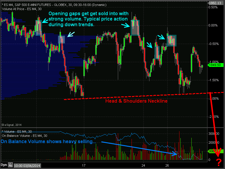
Index ETF Trading Strategies: Stocks have kick started this week with a 0.85% pop in price but the big question is if the market can hold up. Last week stocks repeatedly gap higher and sold off with strong volume telling us that institutions are slowing phasing out of stocks (distribution selling) unloading shares into strength and passing them onto the a average investor to be left holding bag.

I want to show you a couple charts which show the price action, volume and money flow of the SP500 so you have a visual of what I am talking about.

30 Minute Intraday SP500 Chart – ETF Trading Strategies

In the chart below you can see the price gaps followed by selling. Why is this important? It is important because during a down trend the market makers and big money plays who have the money and tools to manipulate the markets will allow the market drift higher or they will run price up in overnight or premarket trading when volume is light. Once the 9:30am ET opening bell rings volume and liquidity spike which allows the big money player to sell remaining long positions and or add to short positions they have.

If you look at the blue on balance volume line at the bottom of the chart you can clearly see that more contracts are being sold than bought which is typically an early warning sign that the market is about to fall farther.

ETF Trading Strategies
 

Automated Trading System – 30 Minute ES Futures Chart


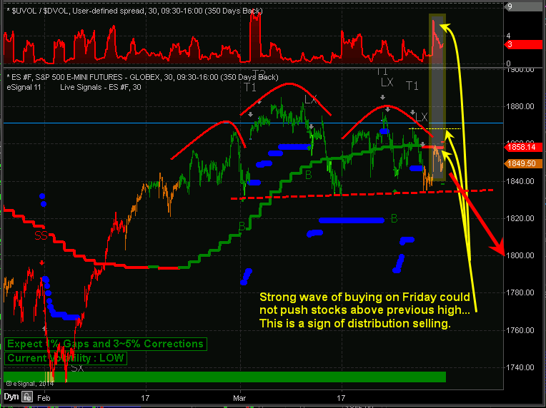
Below is a marked up screen shot of my automated trading system which I use for timing both futures and ETF trading strategies. The color coded bars tell you the market trend along with the strength of buyers and sellers.

When you couple market cycles, trends, volume/money flow, along with chart patterns we can forecast and trade markets with a high degree of accuracy in terms of market direction and timing.

Automated Trading Systems
 
My Index ETF Trading Strategies Conclusion:
 
Just to be clear on the current market trend and my overall outlook let me explain a little more. Overall, the broad stock market remains in an uptrend. Thursday and Friday of last week we started getting orange bars on the chart telling us that cycles, volume, and momentum are now neutral. It’s 50/50 on which way the market will go from here, so until the market internals (cycles, volume, breadth) push the odds in our favor enough for a short sell trade or a new long entry we will not add new positions to our portfolio.

It is important to understand that nearly 75% of stocks/investments move with the broad market. So we don’t want to add more long positions when the odds are not in favor of higher prices. Trading in general is not hard to do, but creating, following, executing properly money and position management is. If you have trouble with following or creating an ETF trading strategy you can have my ETF trading system for rising, falling and sideways markets traded automatically in your trading account.

Learn more here about my Automated Trading Systems

See you in the market! 
Chris Vermeulen


Sign up for one of our Free Trading Webinars....Just Click Here!


Sunday, December 8, 2013

Christmas Rally Starts Monday....My ETF Trading Strategies

Our trading partner Chris Vermeulan says "Tis the Season for the most powerful seasonality trade of the year". Do you agree?


Seasonal ETF Trading Strategies With the stock market up big in 2013 and most participants are speculating on a pullback in the next week or two, Chris says he is on the other side of that bet. Being a technical trader he focuses on patterns, statistics and probabilities to power his ETF trading strategies. So with 37 years of stats the seasonality chart of the S&P 500 index paints a clear picture of what is likely to happen in December.

If you do not know how to read a seasonality chart, Chris will explain it as its very simple. Simply put, it shows what the index has done on average through each month over the past 37 years. December typically has the strongest up trend and probability of happening any other time of the year.

The Big Board – NYSE
 
The NYSE also referred to as the Big Board, is an index with the largest brand name companies. Most individuals do not follow this, but to Chris its as close to the holy grail of trading than anything else he uses. he uses many different data points from this index (momentum, order flow, trend) for his ETF trading strategies.

Let's take a look at what Chris says the seasonality chart his telling us as we close our 2013 and move into 2014......Click here to check out "Christmas Rally Starts Monday....My ETF Trading Strategies"


Get our "Gold and Crude Oil Trade Ideas"


Friday, November 15, 2013

Option Probabilities Spell Possible Trouble for Treasury’s

Our trading partner J.W. Jones is coming at us today with a great post on where he sees the Treasury ETF TLT headed. Great guidance for where the market at large just might be headed.....

The incredible rally in equities in 2013 has begun to stir concern among many that the stock market is now in a bubble. We have entered the euphoric stage of this bull market and equity prices cannot and will not go lower according to some talking heads in the financial punditry.

While chatter is starting to heat up that equities are in a bubble, the real bubble seems to be ignored for the most part. The larger, more concerning bubble is in the Treasury marketplace where the Federal Reserve continues to print money to purchase treasury bonds to help keep interest rates artificially low.

Instead of debating the bubbles in Treasury’s versus equities, or trying to predict when the bubble in either asset class may pop, I want to focus on the near term for price action expectations in longer dated Treasury bonds.

Here is a weekly chart of the Treasury ETF TLT which is supposed to reflect the price action and yield generation of a portfolio of 20+ year duration Treasury bonds issued by the U.S. federal government.....Read "Option Probabilities Spell Possible Trouble for Treasury’s" 


"Wall Streets Best Kept Secret....Now you are in the loop"


Thursday, October 24, 2013

Precious Metals: Gold, Silver and Miners Are Trapped

The precious metal market has been stuck in a strong down trend since 2012. But the recent chart, volume and technical analysis is starting to show some signs that a bottom may have already taken place.

This report focused on the weekly and monthly charts which allow us to see the bigger picture of where the precious metals sector stands in terms of its trend. Let’s take a look at a few charts below for a quick overview, but if you want more interesting ...... Click here to Read More.

Wednesday, February 27, 2013

Playing the ABC Gap fill for swing trading entry at ATP

From guest analyst David Banister....

One of my favorite “Crowd Behavioral” patterns is the ABC Gap fill pattern. This is a normal correction pattern in the stock market that works off overbought sentiment. You can apply this to liquid individual stocks in most cases, and look ahead to spot potential entries on your watch list for trading.

A sample we will use today is KORS, a fast growth stock of the leading luxury retailer Michael Kors. We notified our subscribers several days in advance to watch for a gap fill at $57 on this stock before entering a long trade. We also spotted what looked like a classic C wave pattern coming down from a B wave interim top.

Sure enough it took several days but the stock worked its way down to $57 and hit the gap on the nose on February 26th. It immediately reversed to end the day $2.25 higher or about 4-5% swing gains on this pattern. The chart below shows a 1, 2, 3, and 4 pattern with ABC making up the 4 pattern on KORS stock.

ATPfeb27


At ATP, we look for ABC and other patterns in growth plays and swing trade them long for reversals, just as the crowd of traders has stopped out and gone sour on the stock. Consider joining us by learning more at The Active Trading Partners.com


Get our low risk entry points and broad market technical analysis!

Wednesday, March 23, 2011

Modern Music, Options, the SPX, the XLF and your Mood!

What could modern music, options, the SPX, the XLF and your Mood have in common? Let's have options guru J.W. Jones tell us......

Before getting into the broader markets, I thought it was pertinent to share with readers that recently I have noticed a trend in alternative music, also known as modern rock. As a fan of music in general, I have noticed that more modern and mainstream music is starting to underscore the deterioration in social mood. Mainstream songs are having a resoundingly similar lyrical undertone which outlines the “us against them”, “rich versus poor”, and the political class versus everyone else.

While I am not a sociologist nor do I have any real training in the area, the underlying tone in a lot of artistic mediums highlights the current chasm between the haves and the have nots. While some might argue that it does not matter, if you as a reader, trader, or investor believe in behavioral finance you might agree that social mood matters a great deal. After all, the entire premise of technical analysis is an attempt to quantify market participant behavior at specific price levels.

Social mood is but one catalyst that can have a dramatic impact in price discovery, and thus must at the very least be monitored. Current music trends are literally screaming loud and clear that the average American can relate to the undertones and messages of song lyrics with the same resounding tone as the Rise Against lyrics listed above. Believe me, it may not matter right now, but it will matter and when it does it will likely be too late for financial markets.

Now that I have my little rant out of the way, why don’t we take a look at where the S&P 500 has been, where it is now, and where it might be going. Currently price action in the S&P 500 is sitting on the edge of a fence. We could be looking at an intermediate bottom or it could end up being a bull trap. As for me, my recent prediction for lower prices has indeed come to pass, but from hereon I have no real idea where price action is headed. Mr. Market is leaving a few clues behind which I will outline, but anything is possible. We have seen stocks climb a wall of worry for nearly two years now so there is precedent for a rally from this current point of indecision.

The daily chart of the S&P 500 listed below illustrates key technical levels on the daily chart, however readers will notice that we are currently caught between a ton of overhead resistance and a key support level. Until we see price move in either direction with volume confirmation, I will be sitting on the sidelines.


Another key chart to consider is the SPX weekly chart. A quick glance at the slow stochastic readings at the bottom of the chart reveal that the S&P 500 might have additional downside left before the market is able to form a solid bottom. If that is true, we could see the SPX test the 200 period moving average on the daily chart which would be around the 1186 price level. Additionally, the 50 & 200 period moving averages on the weekly chart correspond with the 1180 price level which is likely not coincidental. The level also corresponds with key resistance areas going back to the November 2010 lows. While a downward move that large seems a bit extreme to me at this point, anything is possible.


As can be seen from the chart above, price action is currently sitting above the 20 period moving average on the weekly SPX chart. Key support levels are around the 1225 and 1180 price levels. I would also point out that a Fibonacci retracement of the recent pivot high to the recent pivot low gives us a possible 1.618 retracement around the 1190 price level. Additionally, the slow stochastic on the chart above is eerily similar to levels that were seen on the weekly chart back in May of 2010. Will price action work lower? Will the weekly slow stochastic reading kiss the 20 level?

At this point, a few of you might think I’m outlining the case for lower prices in the equity market. I honestly have no idea where price is going from here, I’m just outlining some key aspects that I have found in my analysis to the downside. The upside is just as likely and we could see the SPX price bounce off of the 20 period moving average on the weekly chart and a challenge of the recent highs could play out. Should recent highs give way to breakout, the SPX would likely test the 1,400 price level at some point in the future.

If we look at the VIX for any clues, all that can be seen from that chart is a spike higher and a subsequent selloff as fear and uncertainty leave the marketplace. The VIX is currently arguing for higher prices in equities, however the financials represented by XLF are the fly in the proverbial ointment. The banks were unable to attract a bid on Monday’s strong advance and they experienced additional selling pressure on Tuesday.

In fact, the XLF’s daily chart shown below reveals a key test and subsequent failure.


A quick look at the XLF daily chart and it is rather obvious that price action in XLF has been weak in the past two sessions. Price moved higher off of the recent lows, tested the 20 period moving average and rolled over. Price is currently below key support levels, but we could witness a reversal on Wednesday. I am going to be watching the financials (XLF) quite closely in coming days as I believe the banks will provide traders with clues as to which direction Mr. Market is favoring. Right now it would appear that Mr. Market is favoring lower prices, but that would seem a bit too easy from these eyes.

We could consolidate at these price levels for a period of time. The volume on Monday and Tuesday was light and we have non confirming signals showing up in a variety of underlying indices. I am unwilling to accept any directional risk at this point. I will let others do the heavy lifting while I sit safely in cash and watch the price action play out.

The price action will eventually give us a confirming signal as to which direction prices will be heading, but right now I believe the prudent thing to do is remain in cash and wait for Mr. Market to signal which direction he favors. We are either sitting at the beginning of a major move higher or we are at a precipice and prices are about to plunge. Either way, risk remains high and the risk/reward is simply not there to warrant an entry. As I have said many times, sometimes the best trade is no trade at all!

Just click here to get J.W.'s "Profitable Options Strategies Report"


Share

Friday, November 6, 2009

RIMM’s Big Buyback Bet


“Research In Motion Ltd. (RIMM) will spend up to $1.2 billion to buy back about 21 million of its shares, or 3.6% of its total shares outstanding. The buyback will start Nov. 9 and last for up to one year.”

That was the headline news today on Research in Motion symbol RIMM so I decided to look at the chart to see what was going on in the “real world”. When I got to the chart, one thing immediately jumped out at me and that was the negative action that this market has shown in the past several weeks. Looking at this market a little closer I was able to see that our “Trade Triangle” technology was 100% negative and that our monthly “Trade Triangle” indicator had turned negative on October 28th at $63.38. This is a major negative in my mind for this market.

In this short video we show you exactly what we expect to see for RIMM in the future. We'll also share with you some downside targets that we are looking at which may surprise you.

Just click here to watch the video and as always our videos are free to watch and there is no need to register. We hope you enjoy the video and please feel free to leave a comment.