Showing posts with label Trend. Show all posts

Friday, June 5, 2020

Gold & Silver “Washout” - Get Ready for a Big Move Higher

Gold and Silver moved lower early on June 2nd and 3rd. Our research team believes this is a “Washout Low” price rotation following a technical pattern that will prompt a much higher rally in precious metals. This type of washout price rotation is fairly common before very big moves after Pennant/Flag formations or just after reaching major price trigger levels.

With Gold, a sideways Pennant/Flag formation has been setting up near our GREEN Fibonacci Price Amplitude Resistance Arc. We believe the downward price rotation recently is a perfect setup for skilled technical traders to take advantage of lower entry price levels. The GREEN Fibonacci Price Amplitude Arc will very likely be breached over the next 5 to 10 trading days and the price of Gold should rally well above $1850 in the process. We believe this Washout Rotation is a process of running through the Long Stops just below recent price activity that will end with a defined upside price rally over the next 2 to 5+ weeks.

Before we continue, be sure to opt-in to our free market trend signals 
 before closing this page, so you don’t miss our next special report!


Silver has set up a completely different type of price pattern – a true Double-Top pattern. The downward price rotation recently in Silver is indicative of a weaker reaction to this massive resistance pattern and Double-Top. The likelihood that Silver will find support above $17 and mount a further upside price rally over the next 2 to 5+ weeks is still very strong. After the deep downward price collapse in Silver took place, just like what happened in 2009 and 2010, the upside potential for Silver is still massive – likely targeting $65 per ounce of higher.


This current Gold to Silver Ratio Monthly chart highlights the recent collapse in the ratio level as Silver rallied from near $12 towards current levels near $18. A similar spike in the Gold to Silver Ratio took place in 2008-09 – just before the broader market collapse in the US and Global markets took place. This happens as the initial reaction to risk in the global markets pushes Gold prices a bit higher while Silver, the often overlooked store of value, typically declines in value.

Once the price of Silver starts to rally, pushing the Gold to Silver ratio below 60 typically, both Gold and Silver start to align in price and begin to rally together. The current level of the Gold to Silver ratio is 94.9. This suggests that both Gold and Silver have quite a way to go in terms of reaching the “alignment phase”. Our researchers believe Gold will rally above $2100 to $2400 and Silver will rally above $40 to $50 before the two metals align and begin to rally together in almost equal strength.


Concluding Thoughts

Pay attention to what happens to precious metals over the next 10 to 15+ days. If our research is correct, both Gold and Silver will rally higher by about 7.5% to 14% – setting up new price highs for both metals. When the washout pattern completes, usually a fairly aggressive price trend begins where new price highs are established fairly quickly. Get ready, this should be a really nice upside price swing in precious metals over the next 6+ months or longer.

The next few years are going to be full of incredible opportunities for skilled traders and investors. Huge price swings, incredible revaluation events, and, eventually, an incredible upside rally will start again.

I’ve been trading since 1997 and I’ve lived through numerous market events. The one thing I teach my members is that risk is always a big part of trading and that’s why I structure all of my research and trading signals around “finding profits while reducing overall risks”. Sure, there are fast profits to be made in these wild market swings, but those types of trades are extremely risky for most people – and I don’t know of anyone that wants to risk 50 or 60% of their assets on a few wild trades.

I’m offering you the chance to learn to profit, as I do with my own money, from market trends that I hand-pick for my own trading. These are not wild, crazy trades – these are simple, effective, and slower types of trades that consistently build wealth. I issue about 4 to 8+ trades a month for my members and adjust trade allocation based on my proprietary allocation algo – the objective is to gain profits while managing overall risks.

You don’t have to spend days or weeks trying to learn my system. You don’t have to try to learn to make these decisions on your own or follow the markets 24/7 – I do that for you. All you have to do is follow my research and trading signals and start benefiting from my research and trades. My new mobile app makes it simple – download the app, sign in and everything is delivered to your phone, tablet, or desktop.

I offer membership services for active traders, long term investors, and wealth/asset managers. Each of these services is driven by my own experience and my proprietary trading systems and modeling systems. I have a small team of dedicated researchers and developers that do nothing but research and find trading signals for my members. Our objective is to help you protect and grow your wealth.

Please take a moment to visit The Technical Traders to learn more. I can’t say it any better than this… I want to help you create success while helping you protect and preserve your wealth – it’s that simple.

Chris Vermeulen
Chief Market Strategist
Founder of the Technical Traders 


Friday, November 29, 2019

100% Measured Moves May Signal a Top

One type of Fibonacci price structure we use to attempt to measure price trends and identify potential tops/bottoms is the “100% Measured Move” structure. This is a price structure where a previous price move is almost perfectly replicated in a subsequent price trend after a brief period of retracement or price correction. These types of patterns happen all the time in various forms across multitudes of symbols to create very solid trading signals for those that are capable of identifying trends and opportunities using this technique. If you want my daily analysis and trade ideas, be sure to get my updates by joining my free trend signals email list.

The first thing we look for is a strong price trend or the initially confirmed reversal of a price trend. We find that these trending price ranges and initial “impulse trends” tend to prompt 100% measured moves fairly accurately. The explosive middle trend is where one can’t assume any type of Fibonacci 100% measured move will happen. Those explosive moves in a trend that tend to happen in the middle of a price trend are what we call the “expansion wave” of a trend and will typically be 160% or more the size of the initial impulse trend.

These trade setups we call the “100% measured moves” are naturally occurring price rotations that skilled traders can use to identify strong trade potential setups. They are more common in rotating markets where a moderate trend bias is in place (for example in the current YM or ES chart).

First, let’s take a look at this YM Weekly Chart to highlight the most recent 100% Measured Move. The original upside price move between June 2019 and July 2019 resulted in a 2787 point price rally that replicated between August 2019 and November 2019 – after a brief price retracement. Currently, price is rotating near the peak of this 100% measured price move near 27,875 while attempting to set up a new price trend.


In this ES Weekly example chart, we see a 100% Measured Move that originated in June 2019 and ended in July 2019 – just like on the YM chart. Although the completion of the 100% measured move didn’t originate until the low that formed before price rallied to take out the previous high near 3029.50. Remember, the other facets of Fibonacci price theory are also still at play in the markets while these 100% Measured Moves are taking place. Thus, rotation between a previous price peak and valley (without establishing any new price highs or new price low) are considered “price rotation” – not trending. The 100% Measured Move that did take place recently did complete a full 100% advancement and is now stalling near the 3040 level peak.


If you are not familiar with some of my forecasting and trading strategies for trading the S&P 500, or my gold trading signals be sure to click those links to see some pretty interesting charts like these.

SP500 Index Trend Identification and Trade Signal System


Cycle and Price Prediction System


Concluding Thoughts

Once these 100% measured moves complete, price usually attempts to stall or wash out a bit before attempting to establish a new price trend. At this point, given the examples we’ve illustrated, we believe the US market will enter a period of rotation and moderate volatility as these 100% measured moves have completed the upside price advance for now. Some level of price rotation after these 100% measured moves have completed will potentially allow for another attempt at a future 100% price advance after setting up a new price leg.

These techniques don’t always work, we recently got stopped out on a TVIX (vix/volatility trade for a loss) but we just close out our thirst natural gas trade for a quick 7% profit. The previous UGAZ trade netted 20%, and the one before that was 7.95%.

I can tell you that huge moves are about to start unfolding not only in metals, but stocks, and currencies. Some of these supercycles are going to last years. Brad Matheny goes into great detail with his simple to understand charts and guide about this. His financial market research is one of a kind and a real eye-opener. PDF guide: 2020 Cycles – The Greatest Opportunity Of Your Lifetime

As a technical analysis and trader since 1997, I have been through a few bull/bear market cycles. I believe I have a good pulse on the market and timing key turning points for both short term swing trading and long term investment capital. The opportunities are massive/life changing if handled properly.

I urge you to visit my Wealth Building Newsletter and if you like what I offer, join me with the 1 or 2 year subscription to lock in the lowest rate possible with our BLACK FRIDAY offer, PLUS get a FREE BAR OF GOLD and ride my coattails as I navigate these financial markets and build wealth while others lose nearly everything they own during the next set of crisis’.

Chris Vermeulen
The Technical Traders


Stock & ETF Trading Signals

Wednesday, April 17, 2019

Watch the Financial Sector for the Next Topping Pattern

A very interesting price pattern is setting up in the financial sector that could lead to a very big move in the US & Global markets. Remember how in 2008-09, the Financial sector and Insurance sector were some of the biggest hit stock sectors to prompt a global market crisis? Well, the next few weeks and months for the financial sector are setting up to be critical for our future expectations of the US stock market and global economy.

Right now, many of the financial sector stocks are poised near an upper price channel that must be breached/broken before any further upside price advance can take place. The current trend has been bullish as prices have rallied off the December 2018 lows. Yet, we are acutely aware of the bigger price channels that could become critical to our future decision making. If there is any price weakness near these upper price channel levels and any downside price rotation, the downside potential for the price is massive and could lead to bigger concerns.

Let’s start off by taking a look at these Monthly charts

This first Monthly Bank Of America chart is best at showing the price channel (in YELLOW) as well as a key Fibonacci price level (highlighted by the MAGENTA line). We’ve also highlighted a price zone with a green shaded box that we believe is key support/resistance for the current price trend.

As you can see from this chart, since early February 2018, the overall trend has shifted into a sideways bearish trend. The price recovery from December 2018 was impressive, yes, but it is still rotating within this sideways/bearish price channel. Our belief is that this YELLOW upper price channel level MUST be broken in order for the price to continue higher at this point. Any failure to accomplish this will result in a price reversal that could precipitate a 30% price decline in the value of BAC. In other words, “it is do-or-die time – again”.


This Monthly JPM chart shows a similar pattern, yet the price channel is a bit more narrow visually. We have almost the same setup in JPM as we do in BAC. The same channels, the same type of Fibonacci price support level, the same type of sideways price support zone (the shaded box) and the same overall setup. As traders, we have to watch for these types of setup and be aware of the risks that could unfold with a collapse of the financial sector over the next few weeks.

We believe the next few weeks could be critical for the financial sector and for the overall markets. If weakness hits the financial sector as global growth continues to stagnate we could enter a period where the global perception of the future 12~24 months may change. Right now, perception has been relatively optimistic in the global stock markets. Most traders have been optimistic that the markets will recover and a US/China trade deal will get settled. The biggest concern has been the EU and the growth of the European countries.

What if that suddenly changed?


We are not saying it will or that we know anything special about this setup. We are just suggesting that the Monthly charts, above, are suggesting that price will either break above this upper price channel or fail to break this level and move lower. We are suggesting that, as skilled traders, we need to be acutely aware of the risks within the financial sector right now and prepare for either outcome.

This last chart, a Weekly FAS chart, shows a more detailed view of this same price rotation and sideways expanding wedge/channel formation. Pay very close attention to the shaded support channel shown with the GREEN BOX on this chart. Any price rotation within this level should be considered “within a support channel” and not a real risk initially. We want to see price break above the upper price channel fairly quickly, within the next 2 to 5+ weeks, and we can to see it establish a new high (above $78 on this chart) to confirm a new bullish price trend. Once this happens, we’ll be watching for further price rotation and setups. If it fails to happen, then the RED DOWN ARROW is the most likely outcome given the current price setup.


Any downside price move in the Financial sector would have to be associated with some decreased future expectations by investors. Thus, our bigger concern is that something is lurking just below the surface right now that could pull the floor out from under this sector. Is it a surprise Fed rate increase? Is it some news from the EU? Is it a sudden increase in credit defaults? What is the “other shoe” – so to say.

Be prepared. If all goes well, then we’ll know within a few more weeks if the upside price rally will continue or if we need to start digging for clues as to why the support for the financial sector is eroding. This really is a “do or die” setup in the financial sector and we urge all traders to pay very close attention to this sector going forward. We believe it will be the leading sector for any major price weakness across the global markets.

Do you want to find a team of dedicated researchers and traders that can help you find and execute better trades in 2019 and beyond? Please visit The Technical Traders to learn how we can help you prepare for the big moves in the global markets and find better opportunities for greater success in the future. Our team of researchers and traders continue to scan the markets for new trades and incredible research for all our members and followers.

Chris Vermeulen

Thursday, March 23, 2017

The Dancing Bears

By Jeff Thomas

In the early 2000s, I recommended to associates that we were in for a major gold boom. Most thought that this was a ridiculous suggestion and didn’t buy a single ounce. I continued to recommend the purchase of gold regularly over the ensuing years, and the price continued to rise. Only in 2011 did they start to buy, at a time when gold was peaking. We were due for a correction and in late 2011, it arrived. For several years, the price has remained in the neighbourhood of $1,200—roughly the price it needs to be to bother removing it from the ground.

During that time, gold has periodically risen a bit, then gotten knocked down again. It’s understandable that this should happen. Central banks have a stake in holding down the gold price, since a rising gold price makes it appear more attractive than storing cash in banks. We’ve reached the point that the central banks have run out of tricks to float the economy and we’re already past due for a crash.

But crashes don’t always occur as soon as they become logical. As long as the public can be fooled into remaining confident in the system, a doomed economy can limp along for a bit before toppling. Statistics on unemployment and inflation can be fudged (and they have been). The stock market can be falsely pumped up (and it has been) in order to create the illusion that all is well. These factors, taken together with knocking down the price of gold periodically, helps to convince people that they should keep their money in cash and their cash in the bank, not in gold.

Just as in 2000, the number of people who understand that gold is not the equivalent of a stock but a store of wealth during dramatically changing times is quite small—certainly less than 1% and more likely less than 1/10th of 1%. Those that possess this understanding tend to hold gold long-term and are relatively unconcerned about fluctuations—even if they’re over $100 in a given month. They’re in it for the long haul and believe that, eventually, gold will rise dramatically and may well be the only safe haven after a crash.

But let’s go back to those speculators that waited until gold had risen dramatically before jumping on board the gold train. During the last four-year period, whenever gold rose as a result of economic and political developments, many of them would buy in once more, after it had risen significantly. Then, when it had been knocked down again, they tended to sell—often at the new bottom.

Of course, this behaviour is not limited just to the purchase of gold. In fact, a very high percentage of investors “play” the stock market in this way. They wait until everyone and his dog is buying in and the price is peaking, often buying on margin in order to maximize their positions. Then, when the bubble pops, they tend to ride the market down, hoping in vain that the price will return at least to what it was when they bought in. In essence, they tend to buy high and sell low almost every time.

The gold bears—those investors who don’t truly understand that gold is a very different animal from stocks—typically dislike gold but buy high when it becomes trendy to do so and sell low after it’s been knocked down. This dance is guaranteed to cause the gold bears to lose money time after time.

The dance is sometimes described as “chasing the market,” or “following the trends.” Brokers keep the dance going by advising their clients of established trends, telling them that they’re “missing out if they don’t get in now.” They serve as the market’s equivalent of a caller in a square dance: “Swing your client to and fro—watch his investment dollars go.”

Just as few investors understand the economic nature of gold, they also tend to overlook the fact that the broker doesn’t benefit from the success of the client—he makes his money when the client buys and sells frequently. So, of course his advice is going to be for the client to keep dancing.

So, will this dance go on as it is, ad infinitum? Well, no. There will be a dramatic change following a crash in the markets. Following any major crash, a panic occurs and whatever money is left on the table scrambles to find a new (hopefully safe) home. Following the coming crash, a portion of that money will head into gold. The price will rise dramatically, very possibly to such a degree that it can no longer be easily knocked down by the central banks.

At first the gold bears will assume that it’s an anomaly. Then, as gold passes $1,500, some will dip their toes in. As it passes $1,800, some will wade in. Beyond $2,000, this trend will strengthen quite a bit. As the crash deepens, stocks will tumble further. The bond bubble may also pop, increasing gold’s shine. At some point, bankers may begin to freeze accounts, create bank holidays, and/or confiscate deposits. At that point, gold will head into its long-predicted mania phase and the bears will be falling over each other, chasing the buying trend.

Gold will rise to a logical price in keeping with its value as a hedge against a collapsing economy. At that point, it would make sense for it to stop, but that’s not what will happen. Those who understand gold will cease their purchases and sit on what they have. But then a new dance will begin. The bears will become decidedly bullish. It’s important to note that, at this point, they will not fully understand why gold is rising so dramatically; they’ll just know that it is. They’ll want to get in on the gold rush and will do whatever they have to in order to keep buying.

They’ll find that physical gold is in short supply, as traditional holders are unwilling to sell, seemingly at any price. Potential buyers will offer $50 above spot, then $100 above spot, then more. They’ll additionally buy on margin in order to increase their position. It will be at this point that the mania will take hold. Irrationally high prices will become the new norm. How high will it go? $10,000? $20,000? Impossible to say. It will rise as high as desperation makes it rise, and we cannot now determine what that level of desperation will be.

A new bubble will be created, but this time, it won’t be in stocks or bonds. It’ll be in gold and, like all bubbles, it will eventually pop. This will occur when those who understand the nature of gold recognize that the price has far exceeded what’s logical and, as much as they value gold, they’ll sell a portion of their holdings and use the proceeds to invest in whatever assets have already bottomed and have nowhere to go but up.

They’re likely to retain a portion of their gold holdings for the same reason they always have, but will be happy to release a portion when it becomes significantly overvalued. This will cause the gold bubble to pop and the gold bears, who have recently become bulls, will wonder where it all went wrong. At this point, they still won’t understand gold; they’ll simply have chased yet another trend and lost.

So, is there a moral here? Well, if so, it’s simply that an investor should not become involved in a market that he doesn’t understand. Nor should he trust his broker to understand it for him. Ironically, as long as there have been markets, there have been those who go out on the dance floor without first learning the dance. A great deal of profit will be made by some gold investors, but the majority are likely to leave the floor with empty dance cards.

Regards,
Jeff Thomas

Editor’s Note: Gold is crisis insurance. Without it, you’re highly vulnerable. And there’s a good chance the next financial crisis could wipe you out.

New York Times best selling author Doug Casey thinks that crisis is coming soon. He shares all the details in this urgent video. Click here to watch it now.


The article The Dancing Bears was originally published at caseyresearch.com


Stock & ETF Trading Signals

Monday, August 29, 2016

How to Generate Consistent Returns in These Crazy Market Conditions

Have you noticed we’re getting a lot of brutally sharp reversals in the markets lately? It’s so frustrating because most traders get caught on the wrong side over and over again. So called safe trend trades get destroyed while betting on bold reversals is working like clockwork.

What’s going on?

For years, it was possible to just buy any dip in stocks and crank out winner after winner. But those days are long gone. If you try that now, you’ll burn through your account in the blink of an eye. These days’ trends reverse on a dime, but at the same time, you can’t just blindly pick tops and bottoms either.

Anyone who was short stocks recently learned that lesson the hard way when the market rocketed to new all time highs. The bottom line is that those outdated strategies no longer work. If you want to generate consistent profits in these volatile conditions, you’ve got to adapt. And that’s why this short video by renowned trader John F. Carter is so exciting

You’ve just got to see the breakthrough strategy that allows him to catch massive price swings without breaking a sweat.

See for yourself >>> Click HERE to Watch <<<

If you haven’t heard of John before, he’s a best selling author and trader with over 25 years’ experience. He’s developed a world wide reputation for catching explosive trends in stocks, options, and even futures, too.

So I hope you attend on September 6th, 2016 at 7:00 PM Central for a special webinar called, “Hunting for Tops and Bottoms - Low Risk Setups for Trading Precise Turning Points in Any Market”.

Here’s just some of what you’ll learn....

  *  A simple 3 step process to identify major market turning points in any market

  *  How to find low risk, high probability trades in today's volatile market conditions

  *  Why it’s finally possible to catch tops and bottoms in real time on almost any chart

  *  Why these ‘Bold and Beautiful’ reversal trades can be safer than ‘comfortable’ trades

  *  How to avoid getting suckered into the costly traps that most traders fall into

  *  How to adapt your trades automatically for choppy conditions and big trends

  *  How to know when a support or resistance level is likely to hold or not

And that’s just the tip of the iceberg.

I’m looking forward to this special event and I expect I’ll be taking a lot of notes, too. There may not be a replay and this event will almost certainly fill to capacity – so register now and be sure to show up a few minutes early. Unless you’ve already mastered trading these volatile swings, this could be the most important training you attend this year.

To claim your spot just Click HERE

See you next Tuesday,
Ray @ The Stock Market Club


P.S.   If you have not downloaded John's free eBook do it asap....Just Click Here


Wednesday, March 30, 2016

Believe It or Not, It’s Happening to Gold

Last night as I was going over my charts and running my end of the day analysis the charts jumped out at me with a trade setup and wanted to share my cycle chart for gold with you. The price chart of gold below is exactly what my cycle analysis told us to look for last week WELL ahead of the today’s news and its things play out I as I feel they will then we stand to make some pretty good money as gold falls in value during the month of April.

If you have been following my work for any length of time then you know big price movements in the market like today (Tuesday, March 29th) based around the FED news ARE NOT and SHOULD NOT be of any surprise. In fact, this charts told use about today’s pop 2 weeks ago and we have been waiting for it ever since. The news is simply the best way to get the masses on board with market moves and gets them on the wrong side of the market before it makes a big move in the other direction, most times… not always, though.

Take a look at this chart below. You’ll see two cycle indicators, one pink and one blue. The pink cycle line is a cluster of various cycles blended together which allows us to view the overall market trend of biased looking forward 5 – 30 days. The blue cycle line is a cluster of much shorter time frame cycles in this tells us when we should expect strong moves in the same direction of the pink cycles or counter trend pullbacks within the trend.

One quick point to note with cycle trading is that the height and depth of the cycle does not mean the price will rise or fall to those levels, it simply tells us if the market has an upward or downward bias. The current cycle analysis for gold along with the current price is telling us that today the short term cycle topped which is the blue line and our main trend cycle is already heading lower. The odds favor gold should roll over and make new multi-month Lows in August.
gold-collapse

In short, we have been waiting for gold to have a technical breakdown and to retrace back up into a short term overbought condition. Today Tuesday, March 29 it looks as though we finally have the setup. Over the next 5 to 15 days I expect gold to drop along with silver and gold stocks. There are many ways to play this through inverse exchange traded funds or short selling gold, silver or gold stocks.

This year and 2017 I believe are going to be incredible years for both traders and investors. If treated correctly, it can be a life changing experience financially for some individuals. Join my pre-market video newsletter and start your day with a hot cup of coffee and my market forecast video.

Sign up right here > www.The Gold & Oil Guy.com

Chris Vermeulen


Stock & ETF Trading Signals

Wednesday, January 20, 2016

Technical Evidence Indicates Major Price Movement Just Getting Started!

Stocks around the globe were pummeled again last week. This is no surprise to our subscribers as our predictive trend analytics model gave us clear technical evidence that important multi year highs had completed back in the middle of 2015. I continue to remain steadfastly bearish in my outlook for stocks.

Last Friday, January 15, 2016, the SPX broke below its Aug. 24, 2015 low, which is equivalent to a major sell signal if price closes the month below that level.

Last week, The Dow Jones Industrial Average slumped 511 points, or 3.1%, to 15,866, while the S&P 500 slid 64 points, or 3.4%, to 1,856.34, led by the financials, technology and energy sectors. The Nasdaq Composite tumbled 190 points, or 4.1%, to 4,424.35. Subscribers and I managed to catch a 33% quick intra-week bounce trading the SSO ETF and then got out of harm’s way as volatility took hold once again.

European stocks were unable to escape the downward trend from other markets, and the Stoxx Europe 600 index lost 2.8%. The dollar fell to a one-year low vs. the yen. Gold rose $22.40, or 2.1%, to $1,096.20 an ounce.

The SPX is currently testing major support. This is consistent with a “cycle low” that arrived over the weekend. Even though we are in a bear market, we should expect a “Bear Market Rally” sucking every last investor into long positions, before dropping much lower through previous support areas. This will be a very “short term bottom” this week.

We are in a long term downtrend now; it is not a “hiccup” as we experienced back in 2012.

If the stock market is going to stage a rally from here, this is a good time to start, right when everyone is jumping off the ship and the sentiment is so extremely negative. Just to give you a feel for the level of panic selling on Friday, my panic selling indicator which tells us when short term bottoms are likely to happen as everyone is running for the door, this contrarian indicator spiked to 50. Now any reading over 3 is panic in the market, and a reading of 9-18 is typically a multi week low. So you can see how 50 is VERY extreme.

Because we are entering a bear market and institutions will be unloading shares area record pace going forward, I feel this extreme level of panic selling (50) is only going to trigger a bounce lasting a week or so, then more distribution selling will take hold.

trap2
trap1


A slew of disappointing U.S. data shows that manufacturing and consumer spending are in trouble. Empire State factory index declined sharply this month to its lowest level since the recession. Retail sales declined by 0.1% in December 2015 and a report on industrial production compiled showed that activity declined for the third straight month.

The New Year is not off to good start. In fact, it may be the worst start ever of a New Year in many world stock indices. Instead off irrational exuberance that had previously been so evident, investors of world equity markets are clearly starting to panic. We all know things are not right. We know it hasn’t been okay since the 2008 financial crisis. The effort by the central banks to get over the hump has fueled an “Asset Bubble” in the stock markets.

This in turn should start to fuel safe haven buying in gold. Gold’s day in the sun is soon approaching. I believe this new year will prove to be a pivotal year for gold, silver and miners.

The “talking heads” tell us that the stock market is falling because energy prices are falling. We need higher energy (gasoline) prices. Really? They claim that energy companies are going out of business and that tens of thousands of people will lose jobs and unemployment will rise. Really? Didn’t the jobs numbers show hundreds of thousands of people getting new jobs – in fields outside of energy? Who are you going to believe?

Later this week I will be posting an exciting video show you how to make a fortune during this pending bear market and exactly how I did this in 2008 – 2012 to become financially free before I turned 30 years of age. Stay tuned and be sure to opt into my free email list if you want to see this exciting, inspiring and educational video!

Visit Here > www.Gold & Oil Guy.com 
Chris Vermeulen

Stock & ETF Trading Signals

Tuesday, August 11, 2015

The Next Silver Bull May Have Already Started

By Laurynas Vegys

Silver is down 7.1% this year. Will this weakness persist? To find out, let’s look at the key factors in the silver market this year.
  • Like gold, silver fell as the US dollar rose on the back of expectations that the Fed will hike rates.
  • World demand for physical silver fell 4% in 2014, largely due to a record 19.5% drop in investment demand.
  • Silver exchange traded funds (ETFs) did not see big liquidations in 2014. ETF holdings grew by 1.4 million ounces and recorded their highest year end level at 636 million ounces.
The first two factors helped push silver 19.9% lower last year. That’s more than gold or any other precious metal fell. Despite this, silver production rose 5% in 2014. That added to the pressure on prices.


Why did miners produce more silver when prices were falling? Because of:
  • By-product metal. Around 75% of the silver mined is a by-product at gold or base metal mines. These producers will keep mining silver, almost regardless of price.
  • Reduced cash costs. The primary silver producers have cut costs since they peaked in 2012. The main way miners do that is by boosting production to achieve economies of scale.
  • Bull market hangover. Precious metals were in a major bull market from 2001 to 2011. Producers built a lot of mines in response. Nobody wants to pull the plug on a new mine that’s losing money if they think prices will go higher.
That’s the backdrop. Now let’s look at this year’s fundamentals.


Supply


Silver mine output has risen for 12 consecutive years (silver mine supply is a little different, due to hedging, but also trending upward). This year could break this trend. Industry experts at GFMS forecast up to a 4% decline in silver output in 2015. Why? It’s not rocket science. There are now fewer major new mines under construction due to lower metals prices. That leaves scrap supply. But scrap comes from jewelry, and sellers are price sensitive. People like to sell granny’s silver tea set when prices are up. We expect subdued scrap supply until silver heads much higher.

Demand


Investment demand - that’s us - is a big chunk of total silver demand: 18.4% as of the latest figures.
There was a big drop in investment demand last year: 19.5%. This tells us that most short-term investors and sellers have left the market. We don’t know any “silver bugs” who were selling. That means that today’s bullion is in stronger hands. And that means that any new buying will have a strong impact on prices.
But will there be buyers?

The Silver Institute expects more silver demand from investors this year. They say that the first half of 2015 sales of silver bars were the fifth highest on record.

Photovoltaics (PV) is another source of silver demand that many analysts expect to rise in 2015 and beyond. Global PV demand is set to increase by 30% in 2015, according to IHS analysts. China alone has plans to install 17 gigawatts of solar capacity by the end of the year.

The solar industry consumes a small amount of silver compared to jewelry and other electronics. Yet, if PV demand delivers in 2015, it will become the third-largest source of fabrication demand for silver.

Wildcard: Tesla plans to put batteries big enough to power a house in every home. What happens if that takes root is anyone’s guess… but it will be big. Really big. And the impact on demand for silver would be just as huge.


The Deficit


Silver supply went into deficit during much of the big run up from 2001 to 2011. That may happen again. Silver Institute expects the silver supply deficit to grow to 57.7 million ounces in 2015. (Note that even if physical mine supply is up, net supply can be down if a lot of the mine supply was forward sold as hedges.) If the institute is right, it’ll be bullish for silver prices.


The Dollar and the Fed


We believe the dollar is grossly overvalued, and we are not alone. HSBC thinks the greenback’s rise since 2014 could be in its final stage. For the three months between April and June, the US dollar fell against every developed-market currency (save for the yen and the New Zealand dollar).

Many investors seem convinced that the Fed will raise interest as soon as September. We view this as unlikely at this stage. Yes, tightening US monetary policy would propel the dollar to new highs. But an even stronger dollar would mean slicing billions off the US GDP; not exactly a desirable situation from the standpoint of the Fed given the sluggish growth of the economy.  We think the Fed could delay raising rates until 2016. It might even stop talking about rate hikes indefinitely. Each delay, the dollar will get whacked, and that’s good for precious metals.

On the other hand, if the Fed does nudge rates higher this year, it would likely dampen the stock market. That would increase demand for silver and gold. This could push silver prices much higher, given the small size of the market.


The Gold-Silver Ratio


The gold-silver ratio (GSR) tells you how many ounces of silver you need to buy one ounce of gold. The record shows that the GSR often surges during a recession. (See the shaded areas on the chart below.)


Silver is about 17 times more abundant than gold in the earth’s crust. Silver and gold prices were close to this ratio for most of history. These facts make many investors think that the GSR should be 17-to-1 and that eventually it will be.

They may be right, but we’ve never found the GSR to be a strong predictor of gold or silver prices. To us, the GSR “suggests a lot but proves nothing.”


Conclusion


The fundamentals are positive for silver in 2015: less mine supply, and the healthy demand we already see is bullish. The greater demand that’s possible could create a real supply crunch. As a result, we expect silver to hold on throughout 2015 and perhaps even increase faster than gold, if the whole precious metals sector turns positive this year.

As for guessing the future, we have no crystal ball. We can say that Louis’ case for 2015 as a win-win year for silver is backed by the numbers.

P.S. If silver moves off its current level of $15 and into the $20 or $30 areas, silver investors could make large gains. But owners of a unique silver-related security could make gains that are five... 10... even 100 times greater. And right now is a once-in-a-decade chance to buy them very, very cheap.

Our friends at Casey Research are the world’s leading experts in this sector. And they’re EXTREMELY bullish on this rare opportunity. Read on here for details.


The article The Next Silver Bull May Have Already Started was originally published at caseyresearch.com.


Get our latest FREE eBook "Understanding Options"....Just Click Here!

Tuesday, January 13, 2015

Last Week's Volatility Could Be A Harbinger Of Things To Come

There's a war going on right now and I don't mean overseas, I mean right here in the markets. Last week was a perfect example as the intraday swings of the S&P500 clocked in at a staggering 6.5%. Market volatility often is a precursor of things to come, and the irony of all this action was that the market closed with a loss of -0.65% for the week.

The net weekly change for the DOW was -0.53% and there was an even smaller loss of -0.42% for the NASDAQ. All three indices formed an important Japanese candlestick pattern, a weekly doji candle. Why is this important? A doji candlestick often signals indecision in the market. When the doji forms in an uptrend or downtrend, this is normally seen as significant, as it is a signal that the buyers are losing conviction when formed in an uptrend and a signal that sellers are losing conviction if seen in a downtrend.


What To Watch For This Week

A lower weekly close would indicate to me that the buyers are beginning lose control of this aging bull market. Here is the "line in the sand" for each of the indices that I am watching. Once below this line, watch for heavy liquidation to come in across the board.

DOW: 17.262 S&P500: 1,992 NASDAQ: 4.090

Gold Is Now Officially On The Move

You might remember on January 7th, I wrote a post on gold (FOREX:XAUUSDO) and the key neckline level. The key neckline in gold was broken to the upside last Friday when gold closed out the week with a very positive 2.9% gain. I now have a confirmed upside target zone of $1,340, which equates to about $132-$134 on the ETF, GLD. To follow all of the entry and exit points for gold, check in daily with the World Cup Portfolio.

How High Can The Dollar Go?

The U.S. Dollar Index (NYBOT:DX) continues to push higher against most currencies with another weekly gain of 0.85% in the Dollar Index. The question on everyone's mind is, how high can the dollar go without a correction? To this observer, it appears that there are technical storm clouds gathering that could spell trouble for the dollar. Take a look at the RSI indicator and check out the negative divergence that is building on the weekly charts. If you are long the dollar, you might want to review and tighten your stops.

How Low Can Crude Oil Go

That's a question better asked to Saudi Arabia as they continues to keep their oil spigots open to the world. Here is my analysis, the trend is down and picking bottoms or tops in markets is not a high percentage game. Before crude oil (NYMEX:CL.H15.E) changes trend, it needs to begin to base out and find a floor. I will leave picking bottoms to others. Meanwhile, the trend is your friend.

Have a Different View?

I invite your comments, pro or con. As always, we appreciate your feedback.

Just Click Here to get all of my Blog Post in your inBox

Every success with MarketClub,
Adam Hewison 
President, INO.comCo-Creator, MarketClub


Get our latest FREE eBook "Understanding Options"....Just Click Here!


Sunday, November 23, 2014

Week Ending Crude Oil, Gold and Coffee Markets Summary for Friday November 21st

Our trading partner Mike Seery brings us his weekly call on crude oil, gold and coffee. Could crude oil really be headed lower? If king dollar gets it's way it just might be headed much lower. Here's what Mike has to say about this and other futures commodity trades.

Crude oil futures are up 30 cents in the January contract trading higher for the 2nd consecutive trading session as a short term bottom may have been placed as China cut their interest rate today sending crude oil sharply higher in early trade trading as high as 77.82 a barrel before retracing while currently trading at 76.22 if you are still short this market I would place my stop above the 10 day high which in Monday’s trade will come down to 77.92 risking around 170 points or $1,700 per contract. The U.S dollar was sharply higher and that’s generally very bearish the commodity markets, however with China cutting their interest rate that combated the negativity coming out of the Euro currency causing short covering across the board as many of the commodities including energies, metals, and the grain sector were all higher today but continue to place your stop loss at that level and see what Monday’s trade brings. The fundamentals in oil still remain very bearish as Saudi Arabia has not cut production & the United States continues its torrid pace of production flooding the world market so even if you are stopped out on this trade sit on the sidelines and wait for another trend to develop as I’m not totally convinced that lower prices aren’t ahead in 2015. Crude oil futures are still trading slightly below their 20 but still far below their 100 day moving average telling you the trend is still to the downside and if the U.S dollar continues to move higher that eventually will put pressure on prices once again in my opinion but on a day to day basis anything can occur.
TREND: LOWER
CHART STRUCTURE: EXCELLENT

Still a Few Seats Left for this Weeks Free Webinar "Why you Should Trade Options on ETFs"....Just Click Here

As I talked about in yesterday’s blog I am telling investors to remain neutral as I do believe gold prices will remain choppy to lower for the rest of 2014 as prices rallied $9 to trade around $1,200 per ounce as extreme volatility has entered this market and I think today’s price action was very impressive due to the fact that the U.S dollar was up over 50 points which is generally very bearish precious metals, however China cut their interest rate pushing many commodities prices higher. Gold futures are trading above their 20 but below their 100 day moving average moving higher despite the fact that the ECB looks like they’re going to utilize more stimulus which is remarkable in my opinion as I do think if the U.S dollar continues to move higher eventually that will be very bearish gold prices so sit on the sidelines as you do not want to trade a choppy market. This market is extremely volatile with big up price swings and down swings so avoid and move on to a trendy market like the S&P 500. Volatility in gold is amazing lately with many days of a $30 – $50 trading range which is incredible going into the holiday season, however if you remember last year gold’s low was near December 31st and we opened up the next day around $20 higher and I think the same thing will happen because of the fact that stock sales which are losers are sold to offset winning trades come the month of December so I still look for another leg down but still would sit on the sidelines at the current time. TREND: NEUTRAL
CHART STRUCTURE: POOR

In this free video John shares his favorite ETF trading strategies and talks about the upcoming price move in the dollar.......Just Click Here

Coffee futures in the March contract sold off around 600 for the trading week currently trading at 190.70 in New York with high volatility in the last week with several sharply higher and lower trading sessions as I am advising investors to stay away from this market as the trend is extremely choppy and difficult to trade successfully in my opinion. Coffee prices are trading right at their 20 & 100 day moving average telling you that the trend is neutral as this volatility will remain for months to come as weather in Brazil is very fickle on a week to week basis as drought concerns are still in the back of traders’ minds as the weather currently is positive for production. The chart structure in coffee presently is very poor as I like to trade markets with tight chart structure which allows you to place tighter stop losses lowering monetary risk in my opinion. TREND: MIXED
CHART STRUCTURE: POOR

Get our latest FREE eBook "Understanding Options"....Just Click Here!

Thursday, June 19, 2014

Commodities Are Building Bases and About To Rally – Steel Market

Commodities in general have been under pressure for the last couple years. This can be seen by looking at the GCC Greenhaven Continuous Commodity ETF which holds a basket of resources. The weekly chart has formed a bullish bottom pattern, and as of last January it looks as though it’s now building a basing pattern. Overall commodities are in the very early stages of a stage 1 basing pattern and it looks as though it will be a few more months before any significant breakout will occur. But there could be some early entry points if you know what to look for…

A few days ago I talked about how commodities tend to perform well near the end of a bull market in the United States stock market. I also pointed out which hot index was going to benefit from this. In this article I want to bring your attention to the steel market. Using the SLX Steel ETF you can clearly see the bottoming pattern and basing pattern for this commodity. Currently steel is underperforming the stock market and is vulnerable to lower prices. But if we see a few things come together in the coming days or weeks, this could be a screaming buy.

My technical take on steel is this:


SLX has formed a bottoming pattern from January – mid March. It has since put in a strong impulse rally to make a higher high, and is now consolidating above key support. The RSI (Relative Strength) remains in a down trend, but if this starts to rise and SLX breaks above its recent highs around the $47.75 level I feel steel will start to rally with $50 being the next major whole number and previous high for steel to find some resistance.

Also price has been riding along the 200 day moving average which is acting as support. If price closes a couple of days below the 200 moving average I would consider this to be a bearish sign.

SLX


Steel Trading Conclusion:


In short, we are looking for the relative strength to start making new highs. Also we want to see a reversal bar on the SLX chart to the upside which we got on Tuesday. Or you can wait for a breakout and close above $47-48 area. Stop would be somewhere around the $45.75 area to start, then raise it as price rallies using intraday pivot lows on the 30 minute chart.

GET THESE REPORTS DELIVERED TO YOUR INBOX FREE > The Gold & Oil Guy.com


Sign up for one of our Free Trading Webinars....Just Click Here!


Thursday, April 17, 2014

Doug Casey’s Coming Super Bubble

By Louis James, Chief Metals & Mining Investment Strategist

In many of my conversations with legendary speculator Doug Casey since the crash of 2008, Doug has talked about a coming super bubble.

Everything Doug has studied about human nature, history, and economics—from Roman times right up to the present—has him absolutely convinced that the global economy is headed for high inflation, with a very real potential for hyperinflation in the US.

Ben Bernanke's panicked deployment of squadrons of cash-laden choppers has been emulated around the world. The Bank of International Settlements estimates that global debt markets now exceed $100 trillion.
The laws of economics—maybe even physics—say that this inflation, whenever it arrives, must have consequences… and that those consequences cannot be avoided forever.

The easiest consequence to predict, and the one we're betting heavily on, is that the price of gold will move higher. Much higher. That move will in turn ignite a bubble in gold stocks and, as Doug likes to say, a super-bubble in junior gold stocks.

Jeff Clark, editor of our BIG GOLD newsletter, recently illustrated what such a super-bubble can look like, citing figures from several historic bull markets. I hesitate to repeat any of his figures because the right junior stocks' gains when the market goes bubbly are, frankly, hard to believe. However, it is a fact that quite a few junior stocks achieved the much vaunted 10 bagger status (1,000% gains) in previous bubbles, and some even returned 100 fold.

Here’s the essential reason why junior mining stocks are Doug's favorite speculations.

Let's start at the beginning: Doug's mantra is that one should buy gold for prudence and gold stocks for profit. These are very different kinds of asset deployment.

It's particularly important not to think of gold as an investment, but as wealth protection. It's the only highly liquid financial asset that is not simultaneously someone else's liability. Every ounce of gold you physically possess is value in solid form—there is no short to your long. Come hell or high water, it is value you can liquidate and use to secure your needs. That's why gold is for prudence.

Gold stocks are for speculation because they offer leverage to gold. This is actually true of all mining stocks and, more broadly, of stocks in commodity-related companies; they all tend to magnify the price movements in the underlying commodity. But the phenomenon is especially strong in the highly volatile precious metals.

Allow me to illustrate—and in an effort to avoid seeming overly promotional, I'll show how gold stocks' leverage works on the downside as well as the upside. Bad news first: here's a chart showing how gold retreated during October and November of 2008, the worst two months of that year's crash for mining stocks. Also shown are an index of gold juniors and our own portfolio performance. This was, of course, a terrific time to buy, resulting in spectacular gains over the next two years.


Now the good news: here's a chart showing the performance of the same three things in January and February of this year, which saw a major rally in the gold sector.


Here's one more, with a particularly telling point to make. This is the stock price of ATAC Resources (ATC.V) over the same time period as the chart above. The point I want to draw your attention to is that the company had no major news during the time period shown. It's a Yukon gold play, buried deep under the famous snows of the Great White North, so there's no exploration under way, and there won't be until the snow melts weeks or months from now.


This third chart shows in one simple yet powerful way exactly why Doug loves buying these stocks when they're on sale and selling them when they go into bubble mode. ATAC essentially did nothing and still shot up over an order of magnitude more than gold. Note that while this third chart looks like the second, the scales are quite different. (ATAC, by the way, is part of my special report, 10 Bagger List for 2014, that details nine companies I believe could show 1,000% or more returns this year. Note that the report was written before the big move upward you see in the chart above.)

It's worth emphasizing that ATAC's performance this year is just on a rebound from recent lows—imagine what a stock like this could do when Doug's super-bubble for gold stocks arrives.

But what if it doesn't? Or worse—what if we already missed it?

I remember a conversation with Doug back in 2011, when gold rose to within reach of $2,000 per ounce. Many mainstream analysts said gold was in a bubble. I told Doug I couldn't understand why anyone would listen to analysts who've called the gold trend wrong every year since the current bull cycle started. I remember Doug chuckling and saying: "Just wait and see—this is barely an overture."

I am certain Doug is right. That's not because he's the guru, nor because I'm a nutty gold bug, but because no government in history has ever multiplied its currency base without sparking serious and often fatal inflation. That's a fact, not an opinion, backed by enough data to make me extremely confident in predicting what lies ahead for the US dollar, even if I can't say exactly when we'll reach the tipping point.

Since that 2011 interim peak, as we all know painfully well, gold has backed off on par with the correction in the middle of the great 1970s gold bull market. But economic realities require that the market turn around and head for his long predicted super bubble in junior mining stocks before too long. That makes the correction the last, best time to build a substantial position in the stocks best positioned to profit from the coming bubble.

And now Doug is saying that he believes the upturn is at hand. He expects a steadily rising market for a year or two, perhaps more, but not many more, culminating in a market mania for the record books.

Our market does appear to have bottomed. It may take a while to go into its mania phase, but it's already heating up. No one is going to want to be short when this train leaves the station—and the conductor has blown the whistle.

To find out what you could be missing if you don’t invest in junior mining stocks right now, watch Casey Research’s recent video event, Upturn Millionaires—How to Play the Turning Tides in the Precious Metals Market. With resource and investment experts Doug Casey, Frank Giustra, Rick Rule, Porter Stansberry, Ross Beaty, John Mauldin, Marin Katusa, and myself. Watch it here for free, or click here to find out more about my 10 Bagger List for 2014.

The article Doug Casey’s Coming Super Bubble was originally published at Casey Research


Sign up for one of our Free Trading Webinars....Just Click Here!


Tuesday, April 1, 2014

SP500 ETF Trading Strategies & Plan of Attack for This Week

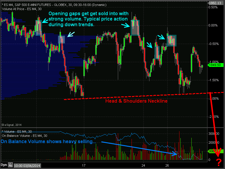
Index ETF Trading Strategies: Stocks have kick started this week with a 0.85% pop in price but the big question is if the market can hold up. Last week stocks repeatedly gap higher and sold off with strong volume telling us that institutions are slowing phasing out of stocks (distribution selling) unloading shares into strength and passing them onto the a average investor to be left holding bag.

I want to show you a couple charts which show the price action, volume and money flow of the SP500 so you have a visual of what I am talking about.

30 Minute Intraday SP500 Chart – ETF Trading Strategies

In the chart below you can see the price gaps followed by selling. Why is this important? It is important because during a down trend the market makers and big money plays who have the money and tools to manipulate the markets will allow the market drift higher or they will run price up in overnight or premarket trading when volume is light. Once the 9:30am ET opening bell rings volume and liquidity spike which allows the big money player to sell remaining long positions and or add to short positions they have.

If you look at the blue on balance volume line at the bottom of the chart you can clearly see that more contracts are being sold than bought which is typically an early warning sign that the market is about to fall farther.

ETF Trading Strategies
 

Automated Trading System – 30 Minute ES Futures Chart


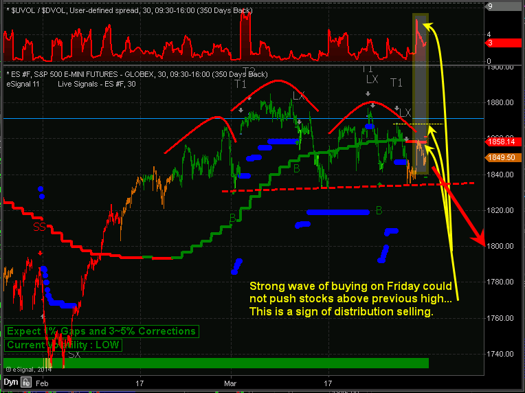
Below is a marked up screen shot of my automated trading system which I use for timing both futures and ETF trading strategies. The color coded bars tell you the market trend along with the strength of buyers and sellers.

When you couple market cycles, trends, volume/money flow, along with chart patterns we can forecast and trade markets with a high degree of accuracy in terms of market direction and timing.

Automated Trading Systems
 
My Index ETF Trading Strategies Conclusion:
 
Just to be clear on the current market trend and my overall outlook let me explain a little more. Overall, the broad stock market remains in an uptrend. Thursday and Friday of last week we started getting orange bars on the chart telling us that cycles, volume, and momentum are now neutral. It’s 50/50 on which way the market will go from here, so until the market internals (cycles, volume, breadth) push the odds in our favor enough for a short sell trade or a new long entry we will not add new positions to our portfolio.

It is important to understand that nearly 75% of stocks/investments move with the broad market. So we don’t want to add more long positions when the odds are not in favor of higher prices. Trading in general is not hard to do, but creating, following, executing properly money and position management is. If you have trouble with following or creating an ETF trading strategy you can have my ETF trading system for rising, falling and sideways markets traded automatically in your trading account.

Learn more here about my Automated Trading Systems

See you in the market! 
Chris Vermeulen


Sign up for one of our Free Trading Webinars....Just Click Here!


Wednesday, March 12, 2014

Elliott Wave Theory - Keys to Investor Success

Elliott Wave Theory - Plenty of people will freely offer you advice on how to spend or invest your money. “Buy low and sell high,” they’ll tell you, “that’s really all there is to it!” And while there is a core truth to the statement, the real secret is in knowing how to spot the highs and lows, and thus, when to do your buying and selling. Sadly, that’s the part of the equation that most of the advice givers you’ll run across are content to leave you in the dark about.

The reality is that no matter how many times you are told differently, there is no ‘magic bullet.’ There is no plan, no series of steps you can follow that will, with absolute certainty, bring you wealth. If you happen across anyone who says otherwise, you can rely on the fact that he or she has an agenda, and that at least part of that agenda involves convincing you to open your wallet.

In the place of a surefire way to make profits, what is there? Where can you turn, and what kinds of things should you be looking for?

The answers to those questions aren’t as glamorous sounding as the promises made by those who just want to take your money, but they are much more effective. Things like careful, meticulous research. Market trend analysis. Paying close attention to extrinsic factors that could impact whatever industry you’re planning to invest in, and of course, Elliott wave theory. If you’ve never heard of the Elliott wave, you owe it to yourself to learn more about it.

Postulated by Ralph Nelson Elliott in the late 1930’s, it is essentially a psychological approach to investing that identifies specific stimuli that large groups tend to respond to in the same way. By identifying these stimuli, it then becomes possible to predict which direction the market will likely move, and as he outlined in his book “The Wave Principle,” market prices tend to unfold in specific patterns or ‘waves.’
The fact that many of the most successful Wall Street investors and portfolio managers use this type of trend analysis in their own decision making process should be compelling evidence that you should consider doing the same. No, it’s not perfect, and it is certainly not a guarantee, but it provides a strong framework of probability that, when combined with other research and analysis, can lead to consistently good decisions, and at the end of the day, that’s what investing is all about. Consistently good decision making.

We use Elliott Wave Theory in real time by looking at the larger patterns of the SP 500 index for example. We deploy Fibonacci math analysis to prior up and down legs in the markets to determine where we are in an Elliott Wave pattern.  This helps us decide if to be aggressive when the markets correct, go short the market, or to do nothing for example.  It also prevents us from making panic type decisions, whether that be in chasing a hot stock too higher or selling something too low before a reversal.  We also can use Elliott Wave Theory to help us determine when to be aggressive in selling or buying, on either side of a trade.

For many, its not practical to employ Elliott Wave analysis with individual stocks and trading, but it can be done with experience.  We instead use a combination of big picture views like weekly charts, Wave patterns within those weekly views, and then zoom in to shorter term technical to determine ultimate timing for entry and exit.  This type of big picture view coupled with micro analysis of the charts gives us more clarity and better results.

One of our favorite patterns for example is the “ABC” pattern.  Partially taken from Elliott Wave Theory, we mix in a few of our own ingredients to help with timing entries and exits.  This is where you have an initial massive rally or the “A” wave pattern. Say a stock like TSLA goes from $30 to $180 per share, which it did.  The B wave is what you wait for and using Fibonacci analysis and Elliott Wave Theory we can calculate a good entry point on the B wave correction.  TSLA dropped from $180 to about $ 120, retracing roughly 38% (Fibonacci retracement) of the rally $30 to $180.  The B wave bottomed out as everyone was negative on the stock and sentiment was bearish. That is when you get long for the “C” wave.  The C wave is when the stock regains momentum, good news starts to unfold, and sentiment turns bullish.  We can often calculate the B wave as it relates often to the A wave amplitude.  Example is the TSLA “A” wave was 150 points, so the C wave will be about the same or more.

When TSLA recently ran up to about $270 per share, we were in uber bullish “C” wave mode, and we had run up $150 (Same as the A wave) from $120 to $270.  That is when you know it’s a good time to start peeling off shares. Often though, the C wave will be 150-161% of the  A wave, so TSLA may not have completed it’s run just yet.

Elliott Wave Theory

Knowing when to enter and exit a position whether your time frame is short, intermediate, or longer… can often be identified with good Elliott Wave Theory practices.  Your results and your portfolio will appreciate it, just look at our ATP track record from April 1 2013 to March 3rd 2014 inclusive of all closed out swing positions.  We incorporated Elliott Wave Theory into our stock picking starting last April and you can see the results:

ATP Elliott Wave Trading


Join Us Today And Start Making Real Money Trading - Click Here


Sincerely,

Chris Vermeulen
Founder of Technical Traders Ltd. - Partnership Program